
Every "best visualization tools" list I've read this year makes the same mistake: it compares Python charting libraries against enterprise BI platforms as if they're substitutes. They're not. Plotly and Tableau solve fundamentally different problems for fundamentally different people. Putting them in a ranked list without acknowledging that wastes everyone's time.
So this guide splits the landscape into three categories based on how you actually build the chart: writing code, dragging elements, or describing what you want in plain language. Ten tools, three workflows, one comparison table to cut through it.
How do these tools actually compare?
| Tool | Category | Price | Language | Best for |
|---|---|---|---|---|
| Tableau | Drag-and-drop | $75/user/mo | Proprietary | Enterprise visual analytics |
| Power BI | Drag-and-drop | $10/user/mo | DAX/M | Microsoft-stack reporting |
| Plotly/Dash | Code-first | Free OSS + Enterprise | Python | Interactive web charts and apps |
| D3.js | Code-first | Free | JavaScript | Fully custom, bespoke visuals |
| Grafana | Drag-and-drop | Free OSS | PromQL/SQL | Time-series and infra monitoring |
| Apache Superset | Drag-and-drop | Free OSS | SQL | Large-scale SQL analytics |
| Observable | Code-first | Free tier | JavaScript | Reactive notebooks, shareable |
| Metabase | Drag-and-drop | Free OSS | SQL | Self-serve business dashboards |
| Streamlit | Code-first | Free OSS | Python | Custom Python data apps |
| Fastero | AI-generated | Free tier | Natural language | Charts from a text description |
Which category fits your team?
The decision isn't which tool is "best." It's which workflow matches how your team actually works.
  How does your team build charts?
  |
  +-- We write code
  |   +-- Need pixel-perfect control over every SVG element?
  |   |   └── D3.js
  |   +-- Want interactive charts in a Python app?
  |   |   └── Plotly/Dash
  |   +-- Building a data app with widgets and logic?
  |   |   └── Streamlit
  |   └── Want reactive notebooks you can share?
  |       └── Observable
  |
  +-- We drag and drop
  |   +-- Enterprise budget, visual exploration?
  |   |   └── Tableau
  |   +-- Microsoft shop, tight budget?
  |   |   └── Power BI
  |   +-- Monitoring infrastructure / time-series?
  |   |   └── Grafana
  |   +-- SQL analysts, large team?
  |   |   └── Apache Superset
  |   └── Business users, simple SQL dashboards?
  |       └── Metabase
  |
  └── We describe what we want
      └── Fastero (AI writes the query + picks the chart)
Fastero
Connect your database. Ask questions. Get dashboards.
Postgres, BigQuery, Snowflake, and 10+ sources — live-connected, AI-powered, no dashboard builder learning curve.
Try free →Code-first: who should write their own charts?
Teams that need full control over rendering, interactivity, or business logic. If your chart is part of an application rather than a dashboard, code-first tools are the only real option.
D3.js — maximum control, maximum effort
D3 doesn't give you a bar chart. It gives you the primitives to build one: scales, axes, shapes, transitions, event listeners. You binddata to DOM elements and specify every attribute. The result can be anything -- a force-directed network graph, a zoomable treemap, a custom Sankey diagram that no BI tool offers as a preset.
The trade-off is time. A grouped bar chart that takes five minutes in Tableau takes an hour in D3. A custom geographic visualization that no other tool can produce takes a day. D3 is the right choice when you need a chart that doesn't exist as a template anywhere else.
Best for: Data journalism, bespoke interactive storytelling, custom chart types that no library ships out of the box.
Honest downside: The learning curve is steep and the API surface is enormous. D3 v7 helps, but you're still binding data to SVG elements manually. Most projects that start with D3 would have been faster in Plotly.
Plotly/Dash — interactive charts without the JavaScript
Plotly is a Python library that produces interactive JavaScript charts. You write Python, and the output is a browser-native visualization with hover, zoom, and pan built in. Dash extends Plotly into a full web application framework with callbacks, layout components, and deployment tools.
The sweet spot is teams that know Python and need charts that stakeholders can interact with. Plotly Express makes simple charts genuinely one-line. Dash makes complex multi-page analytical apps possible without writing any JavaScript. For a detailed comparison of Plotly against Matplotlib, see Plotly vs Matplotlib: Python Visualization Compared.
Best for: Python teams building interactive dashboards or data apps. Scientific teams who need publication-quality interactive figures.
Honest downside: Dash Enterprise is expensive. The open source version works but you're responsible for deployment, authentication, and scaling. Complex callback chains in Dash get hard to debug.
Streamlit — Python apps with built-in charts
Streamlit blurs the line between charting library and application framework. You write a Python script, Streamlit turns it into a web app with widgets, charts, and layout. The charting is good enough (it wraps Plotly, Altair, and Matplotlib), but the real value is everything around the chart: file uploaders, sliders, text inputs, custom business logic.
I've covered Streamlit extensively in Grafana vs Python for Data Dashboards. The short version: if your visualization needs custom logic that SQL can't express, Streamlit is the fastest path from script to shareable app.
Best for: Data scientists building interactive prototypes. Teams that need custom Python processing (ML models, simulations, file parsing) alongside their charts.
Honest downside: Single-threaded by default. Scales to ~20 concurrent users before you need to think about infrastructure. Community Cloud hosting sleeps idle apps.
Observable — reactive JavaScript notebooks
Observable is what Jupyter notebooks would look like if they were built for the web. Each cell is reactive: change a value, and every downstream cell updates automatically. The output is shareable as a URL, embeddable in other sites, and runs entirely in the browser.
Observable Plot (their charting library) shipped in 2022 and is now a credible D3 alternative for standard chart types. You get the expressiveness of JavaScript without manually binding data to SVG. For teams that want interactive, shareable data explorations without setting up a server, it's a compelling option.
Best for: Data journalism, interactive reports, exploratory analysis that needs to be shared via URL. Teams comfortable with JavaScript who want something lighter than D3.
Honest downside: JavaScript-only. If your team writes Python, Observable adds a language boundary. The notebook metaphor doesn't suit production dashboards that need authentication or scheduled refreshes.
Drag-and-drop: who should point and click?
Business users, analysts who think in questions rather than code, and any team where the person asking the question should be able to answer it without filing a ticket.
Tableau — the enterprise visualization standard
Tableau is still the best pure visualization tool on this list. The drag-and-drop interface is genuinely powerful: dual-axis charts, calculated fields, level-of-detail expressions, map layers, dashboard actions. For visual exploration of a dataset, nothing else comes close to the speed of dragging a dimension onto columns and a measure onto rows.
At $75/user/month (Creator license), it's also the most expensive. That price makes sense for a 20-person analytics team at a mid-market company. It's hard to justify for a 3-person startup. Tableau Cloud removes the server overhead; Tableau Server adds governance for large deployments.
Best for: Enterprise analytics teams that need powerful visual exploration, governed data sources, and polished executive dashboards.
Honest downside: Expensive, and the licensing model penalizes exploration. Viewer licenses ($15/user/mo) are cheap but read-only. The moment someone needs to edit a workbook, they need a Creator license.
Power BI — Microsoft's good-enough BI at a fraction of the cost
Power BI does 80% of what Tableau does for $10/user/month. If your organization already runs on Microsoft 365, Teams, Azure, and SQL Server, the integration is seamless. Power BI reports embed in Teams channels, pull from Azure data sources natively, and share through the same permission model as SharePoint.
The visualization library is solid. Not as expressive as Tableau's, but the marketplace has thousands of custom visuals that fill the gaps. DAX (the formula language) is powerful once you learn it, but the learning curve is real. It's not SQL and it's not Excel formulas -- it's its own thing.
Best for: Microsoft-stack organizations that want BI without a second vendor. Teams where $75/user/mo is hard to justify but $10/user/mo works.
Honest downside: The desktop app is Windows-only. DAX is quirky. Performance degrades on large datasets unless you design your data model carefully. The free tier is limited to personal use.
Grafana — time-series monitoring, not business analytics
Grafana is the default dashboard for infrastructure teams. Prometheus metrics, application logs, uptime checks, alerting rules -- it handles the entire observability stack. The plugin ecosystem connects 150+ data sources. If your visualization need is "show me how this system is behaving right now," Grafana is the obvious choice. For a deeper comparison, see Grafana vs Python for Data Dashboards.
Best for: DevOps, SRE, and platform teams monitoring infrastructure. Mixed-source dashboards that combine Prometheus, Loki, and SQL.
Honest downside: Grafana thinks in time series. Business KPIs like "revenue by region last quarter" are possible but feel awkward. If your primary use case is business analytics, Metabase or Superset fit better.
Apache Superset — SQL analytics at enterprise scale
Superset ships 50+ chart types, connects to every SQL database worth mentioning, and handles hundreds of concurrent users. It's the open source answer to Tableau for teams that don't want to pay per seat. SQL Lab is a capable in-browser SQL IDE. The semantic layer enforces consistent metric definitions across dashboards.
Best for: Data teams that write SQL and serve a large internal audience. Organizations that need enterprise BI without enterprise pricing.
Honest downside: Deploying Superset is real work. Python, Redis, Celery, Postgres for metadata, a reverse proxy -- budget a week for production setup. That's why Preset (managed Superset) exists. See Best Open Source Dashboard Tools for a full breakdown.
Metabase — the simplest path to a SQL dashboard
Metabase is the easiest BI tool to deploy and the fastest to get a non-technical user from question to chart. The visual query builder handles joins, filters, and aggregations without SQL. For teams where the analyst-to-stakeholder ratio is 1:20, that self-service capability is worth more than any feature comparison.
Best for: Small to mid-size teams that want self-serve dashboards without a data engineering project. Business users who can learn SQL basics but don't want to manage infrastructure.
Honest downside: Struggles past 50-100 concurrent users without serious caching work. The visual builder tops out at moderately complex queries. Complex analytical use cases will outgrow it.
AI-generated: who should just describe the chart?
Anyone who knows what question they want answered but doesn't want to write the code or learn the tool to answer it.
Fastero — describe the chart, get the visualization
Fastero takes a different approach to the problem. Instead of choosing a chart type and mapping data columns to axes, you describe what you want in plain English. The AI agent connects to your database, writes the SQL, picks the appropriate visualization, and renders it. If the chart needs adjustments, you describe those in natural language too.
This isn't a gimmick layer on top of a charting library. Fastero connects to Postgres, MySQL, BigQuery, Snowflake, and 40+ other sources, writes production-quality SQL, and produces interactive charts you can share, schedule, or embed. The workflow replaces the entire build-query-chart-share cycle with a single conversation.
I'm biased -- I built it. But the reason I built it is that I watched teams spend hours every week on charts that could be described in a sentence. "Show me monthly revenue by product line, with a trend overlay" should not require a Tableau license, a data model, and a 30-minute build session.
For teams exploring this approach more broadly, see Best Python Data Visualization Libraries for the code-first side of the equation.
Best for: Teams without dedicated analysts. Founders, PMs, and ops people who need answers from their data without learning a visualization tool. Anyone who'd rather describe a chart than build one.
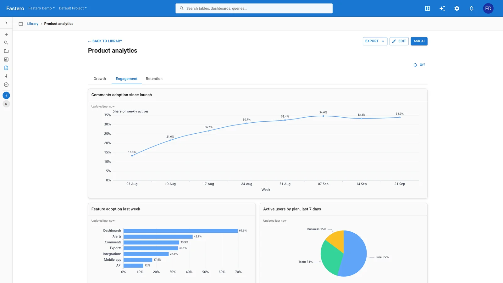
A dashboard in Fastero. Sample data.
How should I actually choose?
Three questions narrow the field:
- Who's building the chart? Engineers comfortable with code have the widest selection (D3, Plotly, Streamlit, Observable). Business analysts do best with Tableau, Power BI, or Metabase. People who don't want to build at all should try Fastero.
- What's the budget? $0 means open source (Grafana, Superset, Metabase, Streamlit, D3) or free tiers (Observable, Fastero). Under $15/user means Power BI. Over $75/user means Tableau.
- Where does the chart live? Embedded in a web app = Plotly or D3. Internal dashboard = Metabase, Superset, or Grafana. Shared report = Observable or Fastero. Executive presentation = Tableau or Power BI.
Most teams end up using two tools. Grafana for infrastructure, Metabase for business dashboards. Plotly for the data app, Tableau for the exec deck. That's not redundancy -- it's using each tool where it's strongest.
FAQ
Which data visualization tool is best for beginners? Metabase if you want drag-and-drop dashboards from a SQL database. Streamlit if you know Python and want to build something custom. Fastero if you'd rather describe the chart in plain English and skip the learning curve entirely.
Is Tableau still worth it in 2026? For enterprise teams with budget, yes. The visual exploration capabilities are unmatched. But at $75/user/month, it's hard to justify for small teams when Power BI does 80% of the job at $10 and Metabase does 60% for free.
Can open source tools replace Tableau or Power BI? Superset comes closest on features. Metabase comes closest on ease of use. Neither matches Tableau's visual polish or Power BI's Microsoft integration. The real question is whether those gaps matter for your use case.
Should I learn D3.js or use a higher-level library? Use a higher-level library unless you need chart types that don't exist as presets. Plotly, Observable Plot, and even Streamlit's built-in charts cover 90% of use cases with a fraction of the effort. Learn D3 when you hit that remaining 10%.
What's the difference between a charting library and a BI platform? A charting library (Plotly, D3, Matplotlib) renders a visualization from data you provide in code. A BI platform (Tableau, Power BI, Metabase) connects to your database, lets you explore data visually, and manages dashboards, permissions, and sharing. The library gives you more control; the platform gives you more infrastructure.
Try Fastero free — describe the chart you want in English. Fastero writes the query and picks the visualization. No credit card required.