
Matplotlib is still the foundation. Plotly is still the best interactive option. Seaborn still makes statistical plots look good with almost no effort. What's changed in 2026 is the layer above them: Altair hit 5.x with proper large-data support, PyGWalker turned Jupyter into Tableau, and Plotnine matured enough that R refugees actually use it in production. Here's how to pick the right library for your chart without trying all seven.
How do these libraries actually differ?
The split isn't "good vs. bad." It's about rendering architecture, API philosophy, and where your output ends up.
Three of these libraries (Matplotlib, Seaborn, Plotnine) render in Python and produce static images. Three (Plotly, Bokeh, Altair) produce JavaScript-based interactive output for the browser. And PyGWalker is a category of its own — a visual exploration layer that sits on top of your DataFrame.
That architectural divide determines almost everything: file size, interactivity, performance at scale, and how your chart gets shared.
1. Matplotlib — the foundation everyone builds on
Matplotlib is 21 years old and still the most-installed visualization library in the Python ecosystem. It's a rasterization engine: your data goes in, pixels (or vectors) come out. Every element on the canvas is controllable down to the point.
It looks dated out of the box. That's fine. The point isn't defaults — it's precision. When a journal wants a 3.5-inch-wide figure at 300 DPI with 10pt Helvetica labels, Matplotlib is the only library that can guarantee it.
import matplotlib.pyplot as plt

months = ['Jan', 'Feb', 'Mar', 'Apr', 'May', 'Jun']
revenue = [42, 49, 61, 55, 72, 68]

fig, ax = plt.subplots(figsize=(8, 4))
ax.bar(months, revenue, color='#2563eb', width=0.6)
ax.set_ylabel('Revenue ($k)')
ax.set_title('Monthly Revenue — 2026 H1')
ax.spines[['top', 'right']].set_visible(False)
fig.savefig('revenue.png', dpi=200, bbox_inches='tight')
Best for: Publication figures, PDF reports, batch-generating hundreds of PNGs on a headless server, anything that needs pixel-perfect layout control.
Honest downside: The API has two personalities (pyplot vs object-oriented) and neither is intuitive. Getting a good-looking chart takes more code than any other library on this list.
For a deeper dive, see Plotly vs Matplotlib: Python Visualization Compared.
Fastero
Connect your database. Ask questions. Get dashboards.
Postgres, BigQuery, Snowflake, and 10+ sources — live-connected, AI-powered, no dashboard builder learning curve.
Try free →2. Plotly — the interactive default
Plotly generates JSON specs that plotly.js renders in the browser. You get hover, zoom, pan, and box-select on every chart by default. The Express API makes one-liners genuinely useful.
import plotly.express as px
import pandas as pd

df = pd.DataFrame({
    'month': ['Jan', 'Feb', 'Mar', 'Apr', 'May', 'Jun'],
    'revenue': [42, 49, 61, 55, 72, 68]
})

fig = px.bar(df, x='month', y='revenue',
             title='Monthly Revenue — 2026 H1',
             color_discrete_sequence=['#2563eb'])
fig.show()
Same data, same chart shape. But now you can hover over each bar, zoom in, and export as PNG from the toolbar.
Best for: Dashboards, web apps, any chart that stakeholders will interact with. Dash and Streamlit both use Plotly as their charting engine of choice.
Honest downside: HTML output bundles the full plotly.js library (~3.5 MB). Performance degrades past ~100k data points unless you switch to WebGL mode. The graph_objects API for fine-grained control is deeply nested and frustrating to debug.
3. Seaborn — statistics without the boilerplate
Seaborn wraps Matplotlib with sensible defaults and a DataFrame-native API optimized for statistical visualization. If you need a distribution plot, regression, heatmap, or pair plot, Seaborn does it in one line where Matplotlib would take fifteen.
import seaborn as sns
import pandas as pd

df = pd.DataFrame({
    'month': ['Jan', 'Feb', 'Mar', 'Apr', 'May', 'Jun'],
    'revenue': [42, 49, 61, 55, 72, 68]
})

sns.barplot(data=df, x='month', y='revenue', color='#2563eb')
Three lines. Good typography, a clean grid, proper spacing. The defaults look professional without tuning.
Best for: EDA in notebooks, statistical analysis reports, any plot where you'd otherwise reach for ax.errorbar() and scipy.stats manually. Kernel density, violin plots, and heatmaps of correlation matrices are Seaborn's sweet spot.
Honest downside: It's still Matplotlib under the hood — static output only. And the moment you need to customize beyond what Seaborn exposes, you're back to raw Matplotlib's API. For a head-to-head with the interactive alternative, see Seaborn vs Plotly: Python Charting Libraries Compared.
4. Altair — the grammar-of-graphics way
Altair is a declarative library built on Vega-Lite. Instead of telling Python how to draw your chart, you describe what your chart should show — encodings, marks, transformations — and Vega-Lite figures out the rest.
The API is elegant. Encoding channels map data columns to visual properties. Faceting, layering, and interaction are composable. If you've ever wished Python had ggplot's philosophy but with interactive output, Altair is it.
Best for: Exploratory analysis where you're iterating quickly on chart types. Altair's concatenation and faceting make small-multiples trivially easy. Great for anyone who thinks in grammar-of-graphics terms.
Honest downside: The 5,000-row default limit still trips people up (you need alt.data_transformers.enable('vegafusion') for larger datasets). The error messages when your spec is invalid are cryptic Vega-Lite JSON errors, not Python tracebacks.
5. Bokeh — when your dataset is big and interactive
Bokeh renders to HTML Canvas and handles hundreds of thousands of points more gracefully than Plotly. Its server mode supports linked brushing and real-time streaming updates without leaving Python.
The API is lower-level than Plotly Express. You build glyphs (circles, lines, bars) and attach them to data sources. That granularity pays off when you need linked selections across multiple panels or server-push updates from a live data feed.
Best for: Large-dataset interactive visualization, streaming dashboards, linked multi-panel exploration. If you need 200k+ points with interactivity and Plotly's WebGL mode isn't cutting it, try Bokeh.
Honest downside: Smaller community than Plotly. Fewer Stack Overflow answers, fewer tutorials, fewer examples. The Bokeh server deployment story (running a Tornado process) adds operational overhead.
6. Plotnine — ggplot2, but in Python
Plotnine is a faithful port of R's ggplot2 to Python. If you're switching from R, the API will feel immediately familiar: ggplot() + aes() + geom_bar() + theme_minimal(). It renders via Matplotlib, so the output is static.
Best for: R users moving to Python who want the same grammar-of-graphics workflow. Also useful for anyone who prefers ggplot2's layer-by-layer composition over Matplotlib's imperative style.
Honest downside: Performance lags behind native Matplotlib for large datasets because of the abstraction layer. The community is small — when you hit a bug, you might be reading the source code rather than finding a Stack Overflow answer.
7. PyGWalker — Tableau in your notebook
PyGWalker turns a Pandas or Polars DataFrame into a drag-and-drop visual exploration interface inside Jupyter. No code required for the chart itself — you drag columns onto axes, pick chart types from a toolbar, and the visualization updates instantly.
It's not a plotting library in the traditional sense. It's an exploration tool that happens to produce charts. Think of it as Tableau embedded in a notebook cell.
Best for: Initial data exploration when you don't know what chart you need yet. Product managers and analysts who want to explore data visually without writing plotting code.
Honest downside: Not programmable. You can't script a PyGWalker chart into a pipeline or export it as a reproducible code artifact. The output stays in the notebook.
How do they compare side by side?
| Library | Interactivity | Max comfortable data size | Learning curve | Output formats | Best use case |
|---|---|---|---|---|---|
| Matplotlib | None (static) | Millions of points | Steep | PNG, SVG, PDF, EPS | Publication figures, batch reports |
| Plotly | Full (hover, zoom, pan) | ~100k (500k with WebGL) | Easy (Express), hard (GO) | HTML, PNG, PDF | Dashboards, web apps |
| Seaborn | None (static) | 100k+ | Low | PNG, SVG, PDF | Statistical plots, EDA |
| Altair | Moderate (tooltips, selections) | 100k (with VegaFusion) | Medium | HTML, PNG, SVG | Grammar-of-graphics exploration |
| Bokeh | Full (linked brushing, streaming) | 200k+ on canvas | Medium-high | HTML, PNG | Large interactive datasets |
| Plotnine | None (static) | 50k-100k | Low (if you know ggplot2) | PNG, SVG, PDF | R-to-Python migration |
| PyGWalker | Full (drag-and-drop) | Depends on browser | Very low | Notebook-only | No-code visual exploration |
Which library should you pick?
         What's the output?
         |
         +-- Static image (PDF, PNG, paper)
         |   +-- Statistical plot? --> Seaborn
         |   +-- Need pixel-perfect control? --> Matplotlib
         |   +-- Coming from R? --> Plotnine
         |
         +-- Interactive (browser, dashboard)
         |   +-- >200k data points? --> Bokeh
         |   +-- Building a web app? --> Plotly
         |   +-- Declarative grammar fan? --> Altair
         |
         +-- Don't know yet (exploring)
             +-- Want to drag and drop? --> PyGWalker
             +-- Want code? --> Plotly Express or Seaborn
Two practical combinations I see working well in real teams:
Notebook-to-dashboard pipeline: Seaborn for quick EDA, Plotly for the charts that end up in a dashboard. Different tools for different stages of the same analysis. (And the environment you develop in shapes the workflow — see Jupyter vs VS Code for Data Science.)
Publication + presentation: Matplotlib for the figures in the paper, Plotly for the interactive version you show in the meeting. Same data, different rendering engines.
What if you don't want to write visualization code at all?
All seven libraries assume you're writing Python. You pick a chart type, map columns to axes, style the output, handle edge cases. And the DataFrame library feeding your charts matters too — Polars vs Pandas covers how that choice affects performance. For a one-off analysis, that's fine. For a team that needs a dozen dashboards updated daily from live databases, it's a lot of boilerplate.
Fastero takes a different approach: connect your database, describe the chart you want in plain English, and the platform generates it. No import matplotlib, no fig.update_layout(). The chart stays connected to live data, updates on a schedule, and lives in a shareable dashboard your team can access without running a notebook.
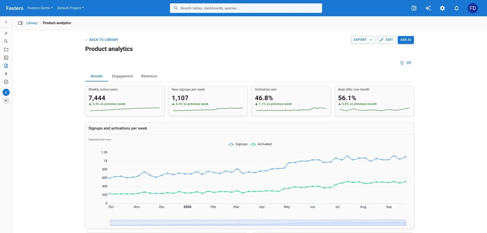
A dashboard in Fastero. Sample data.
It won't replace Matplotlib for your next Nature paper. But for business dashboards and team reporting, it removes the visualization code entirely.
FAQ
Which Python visualization library is best for beginners? Seaborn. It produces good-looking statistical charts from DataFrames with minimal code, and the defaults are modern enough that you rarely need to customize. If you need interactivity, Plotly Express is almost as easy.
Can I use multiple visualization libraries in the same project? Yes, and most teams do. It's common to use Seaborn for notebook exploration, Plotly for interactive dashboards, and Matplotlib for final publication figures. They all work with Pandas DataFrames, so switching between them is mostly a syntax change.
Is Matplotlib still worth learning in 2026? Absolutely. It's the rendering engine behind Seaborn and Plotnine, the default in scikit-learn and most scientific packages, and the only option that gives you full control over every visual element. The aesthetics are dated, but the capability is unmatched.
What's the fastest Python visualization library for large datasets?
Matplotlib handles millions of points because it rasterizes to a fixed-size image. For interactive charts with large data, Bokeh's HTML Canvas rendering handles 200k+ points better than Plotly's SVG-based approach. Plotly's WebGL mode (Scattergl) can push to ~500k-1M for scatter plots.
How does Altair compare to Plotly? Altair is declarative (you describe what the chart should show), Plotly is imperative (you tell it how to draw). Altair produces cleaner code for complex faceted charts and statistical transformations. Plotly has a larger ecosystem, better documentation, and more chart types. If you think in grammar-of-graphics terms, Altair will feel more natural.
Should I use PyGWalker or write code? Use PyGWalker for initial exploration when you don't know what you're looking for. Once you've figured out the right chart, switch to a code-based library so the visualization is reproducible, scriptable, and deployable.
Try Fastero free — connect your database, describe the chart in English, get a live dashboard. No visualization code required. No credit card required.