

Matplotlib and Plotly solve fundamentally different problems, and the sooner you accept that, the sooner you stop fighting your tooling.
I've been using both daily for years. Matplotlib when I need a figure for a paper, a PDF report, or anything that has to look exactly right at a specific DPI. Plotly when I'm building something interactive that lives in a browser — dashboards, exploratory notebooks I share with stakeholders, web apps. The choice isn't about which is "better." It's about where the output ends up.
The rendering engine split
This is the core architectural difference that determines everything else.
Matplotlib is a rasterization engine. It takes your data, applies transforms, and produces pixels (PNG), vectors (SVG/PDF), or renders directly to a GUI backend (Qt, Tk, GTK). The rendering happens in Python, on your machine. The output is a static image. When you call plt.show(), you're looking at a rendered bitmap in a window.
Plotly is a JavaScript visualization library with a Python wrapper. When you create a Plotly figure, Python generates a JSON specification that gets handed to plotly.js in the browser. The browser does the actual rendering — DOM elements, SVG paths, WebGL canvases. Your "chart" is actually a small web application running in an iframe.
This split explains almost every practical difference between the two:
- Why Matplotlib handles 5 million points without blinking (it's rasterizing to a fixed-size bitmap)
- Why Plotly gives you hover tooltips for free (it's running JavaScript event handlers)
- Why Matplotlib works offline on an air-gapped server (no browser needed)
- Why Plotly charts resize when you drag your browser window (they're responsive HTML)
API design philosophy
Matplotlib: two APIs in a trench coat
Matplotlib ships with two completely different interfaces:
pyplot — the MATLAB-inspired state machine. plt.plot(), plt.xlabel(), plt.show(). It maintains a "current figure" and "current axes" implicitly. Fast for throwaway scripts. Terrible for anything complex because you lose track of what you're modifying.
import matplotlib.pyplot as plt

plt.plot(x, y)
plt.title("Quick and dirty")
plt.savefig("output.png")
Object-oriented API — explicit Figure and Axes objects. This is what you use in production code. More verbose, but you always know exactly which subplot you're configuring.
fig, (ax1, ax2) = plt.subplots(1, 2, figsize=(12, 5))
ax1.plot(x, y1, color='#2563eb', linewidth=1.5)
ax1.set_xlabel("Time (s)", fontsize=11)
ax2.scatter(x, y2, s=4, alpha=0.6)
fig.tight_layout()
fig.savefig("publication_figure.pdf", dpi=300, bbox_inches='tight')
The OO API is genuinely powerful. You can control every single element — tick label rotation, spine visibility, legend anchor points, annotation arrows. The cost is verbosity. Getting a publication-ready figure with custom insets takes 50+ lines.
Plotly: Express vs graph_objects
Plotly Express — the high-level one-liner API. Genuinely impressive for how much it does in a single function call.
import plotly.express as px

fig = px.scatter(df, x="revenue", y="churn_rate",
                 color="segment", size="mrr",
                 hover_data=["company_name"])
fig.show()
That gives you an interactive scatter plot with color legend, size legend, hover tooltips showing company names, zoom, pan, and box select. In one line.
graph_objects — the low-level API for fine control. This is where Plotly gets weird. The API is dictionary-based, deeply nested, and the documentation can be hard to navigate.
import plotly.graph_objects as go

fig = go.Figure()
fig.add_trace(go.Scatter(x=x, y=y, mode='lines+markers',
                         line=dict(color='#2563eb', width=2)))
fig.update_layout(xaxis=dict(title="Time", gridcolor='#e5e7eb'),
                  template='plotly_white')
The nesting gets deep fast. Updating a specific axis tick format inside a subplot inside a faceted chart? You'll be reading docs for a while.
Fastero
Connect your database. Ask questions. Get dashboards.
Postgres, BigQuery, Snowflake, and 10+ sources — live-connected, AI-powered, no dashboard builder learning curve.
Try free →The comparison table
| Dimension | Matplotlib | Plotly |
|---|---|---|
| Rendering | Python-side (bitmap/vector) | Browser-side (JS/SVG/WebGL) |
| Interactivity | None by default (mpl widgets exist but are clunky) | Built-in: hover, zoom, pan, box select |
| Max data points | Millions (rasterizes to fixed pixels) | ~100k comfortable, WebGL scatter to ~1M |
| Output formats | PNG, SVG, PDF, EPS, PGF (LaTeX) | HTML, PNG (via Kaleido), PDF (limited) |
| Default aesthetics | Dated (blue/orange since 2.0, still looks academic) | Modern out of the box |
| Customization depth | Total — every pixel is controllable | Good for layout, limited for low-level rendering |
| Learning curve | Steep for good-looking output, easy for basics | Easy via Express, steep for graph_objects |
| Ecosystem | Seaborn, scikit-plot, Cartopy built on top | Dash for full apps, Kaleido for export |
| Notebook experience | Static image in cell output | Interactive widget in cell output |
| File size | Tiny (PNG/SVG) | Large (full plotly.js bundled in HTML) |
| Offline use | Works anywhere Python runs | Needs browser for interactive, static export needs Kaleido |
| 3D plotting | Basic (mplot3d), rotation is painful | Excellent, smooth WebGL rotation |
| Animations | FuncAnimation (complex, slow) | Native frame-based animation API |
Performance with real data
Here's where the rendering architecture really matters.
I regularly plot time series with 2-5 million data points (sensor data, tick-level financial data). Matplotlib handles this without issue — ax.plot(timestamps, values) on 3 million points takes about 2 seconds to render a PNG. The output is the same size regardless of data volume because it's a rasterized image.
Plotly on the same dataset? The browser tab crashes. The JSON spec alone is hundreds of megabytes. Even with WebGL mode enabled (render_mode='webgl' in Express, or Scattergl in graph_objects), you hit practical limits around 500k-1M points for scatter plots. Line charts fare worse because the SVG path element gets enormous.
The workaround for Plotly is downsampling — LTTB algorithm, aggregation, or using Datashader as a pre-processing step. But that adds complexity.
For datasets under 50k points (which covers most business analytics), both perform fine and the choice comes down to other factors.
Where Matplotlib wins clearly
Academic publishing. Journals want PDF/EPS figures at specific dimensions with specific fonts. Matplotlib gives you fig.savefig("figure3.pdf", dpi=300, bbox_inches='tight') and exact control over every text element. Most LaTeX papers use Matplotlib via PGF backend for native font matching.
Pixel-perfect layouts. Complex subplot arrangements with shared axes, inset axes, broken axes, custom colorbars positioned exactly 0.02 inches from the plot edge. Matplotlib's GridSpec and inset_axes handle this. Plotly's make_subplots is more limited.
Batch report generation. Generating 500 PNG charts for a PDF report on a headless server? Matplotlib runs without any display server. No browser, no Chromium, no Kaleido binary — just Python and a rasterizer.
Specialized scientific plots. Polar projections, Smith charts, ternary diagrams, custom map projections via Cartopy. The scientific plotting ecosystem is built on Matplotlib's architecture.
Where Plotly wins clearly
Interactive exploration. Hovering over a point to see which customer it represents. Zooming into a specific time range. Box-selecting outliers. These interactions are built into every Plotly chart by default. Doing this in Matplotlib requires mplcursors or custom event handlers — it's possible but painful.
Web applications. If your chart lives in a browser, Plotly is the natural choice. Dash (Plotly's app framework) lets you build full interactive dashboards in Python. The charts update via callbacks without page reloads.
Stakeholder presentations. I send Plotly HTML files to non-technical stakeholders all the time. They open it in a browser, hover over the data points they care about, zoom into the quarter they're asking about. Try doing that with a PNG.
3D visualization. Matplotlib's mplot3d is frustrating — the rotation is janky, depth ordering breaks with overlapping objects, and the projection feels off. Plotly's WebGL-based 3D is smooth and actually usable for exploring three-dimensional data.
Maps and geospatial. Plotly's choropleth_mapbox and scatter_mapbox produce interactive maps that are far easier to set up than Matplotlib + Cartopy for most business geo-visualization use cases.
The honest workflow
Most data scientists I know (myself included) use both in the same project:
-
Quick exploration in a notebook —
plt.plot()orpx.scatter()depending on whether I need interactivity. For time series I often start with Matplotlib because it's faster for large datasets. For multidimensional data, Plotly Express because hover tooltips are invaluable during exploration. -
Final figures for papers/reports — always Matplotlib. The control over typography, spacing, and exact dimensions is unmatched.
-
Anything shared as a web page — always Plotly. Stakeholders expect to hover and zoom. A static PNG embedded in a webpage feels broken in 2026.
-
Dashboards and apps — Plotly + Dash, or Plotly embedded in Streamlit. The interactivity is the whole point.
What about Seaborn, Altair, Bokeh?
Quick positioning:
- Seaborn is Matplotlib with better statistical defaults and aesthetics. Same rendering engine, same static output. Use it when you want Matplotlib quality with less boilerplate for statistical plots. For a direct comparison with Plotly, see Seaborn vs Plotly: Python Charts Compared.
- Altair is a declarative grammar-of-graphics library that renders via Vega-Lite (also browser-based). Elegant API, but the ecosystem is smaller than Plotly's and the customization ceiling is lower.
- Bokeh is another browser-based interactive library. Solid, but Plotly's mindshare and documentation won after the Datadog acquisition in 2025 gave it enterprise backing.
Choosing for your project
Use Matplotlib when:
- Output is static (PDF, paper, slide deck as images)
- Dataset has >500k points
- You need precise typographic control
- Running on headless servers without browsers
- Building on top of scientific Python ecosystem (Cartopy, scikit-plot)
Use Plotly when:
- Output lives in a browser
- Stakeholders need to interact with the data
- You want good-looking charts with minimal code
- Building a dashboard or web app
- 3D visualization or geographic data
Use both when:
- You're exploring in notebooks (Matplotlib for quick line plots, Plotly for multivariate exploration)
- Your project has both static reports and interactive components
The tooling gap
The real friction isn't in the libraries themselves — it's in getting from "chart in a notebook" to "chart in a dashboard that updates with live data." Both Matplotlib and Plotly produce great visualizations, but connecting them to actual databases, scheduling refreshes, and sharing them with a team requires a separate layer of infrastructure.
That's the problem Fastero solves — you connect your databases, and the platform handles the pipeline from query to visualization to shared dashboard, whether you prefer static exports or interactive charts.
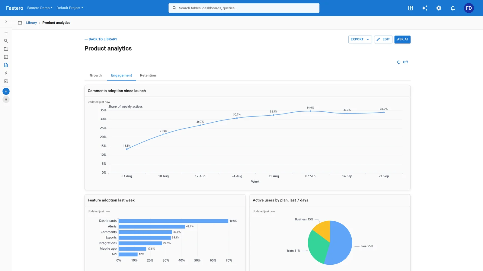
A dashboard in Fastero. Sample data.
Related reading
- Streamlit vs Dash: Which Python Framework for Data Apps
- Grafana vs Python for Data Dashboards
- Streamlit vs Jupyter Notebooks: When to Use Each
- Pandas vs Polars: DataFrames Compared
- Polars vs Pandas for Data Teams
- Jupyter vs VS Code for Data Science
Try Fastero free — run Python analysis on your live data with built-in scheduling, triggers, and team sharing — no infrastructure to manage. No credit card required.