Dashboard example
SaaS Dashboard Example: Signups, Activation, Active Users and Feature Adoption
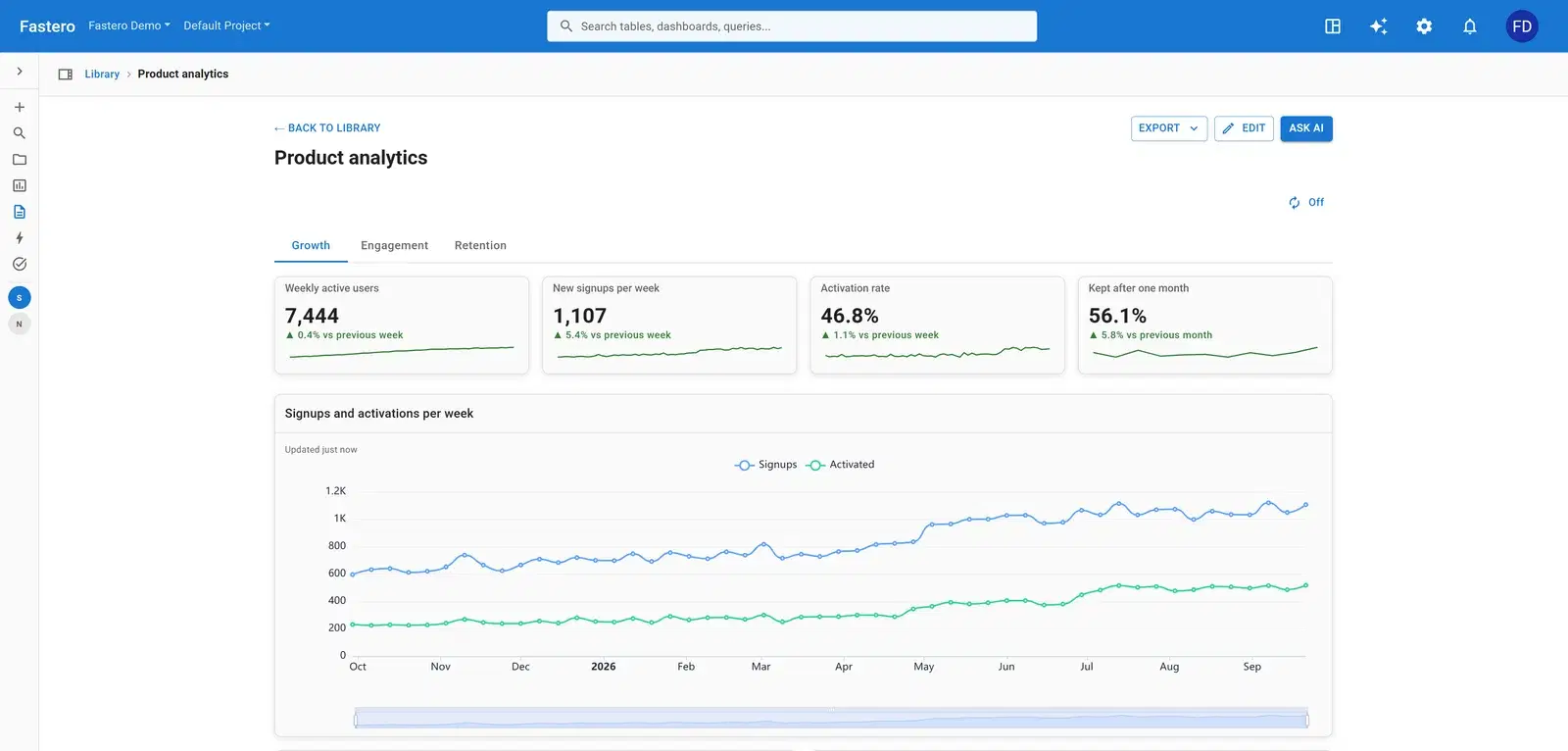
A SaaS dashboard has to show whether new people arrive, whether they get to the point where the product is useful, and whether they keep using it. This one does that for an invented software product across three tabs — growth, engagement and retention.
What's on it
Daily signups and activations by source, weekly and daily active users, a feature adoption table, the signup funnel, workspaces with their seats, and monthly retention by signup cohort.
Growth
- Weekly active users
- New signups per week
- Activation rate
- Kept after one month
- Signups and activations per week
- Signups per week by source
- Signup funnel, last 30 days
Engagement
- Comments adoption since launch
- Feature adoption last week
- Active users by plan, last 7 days
- Active users by country
- Workspaces: seats and weekly actives
- Most active workspaces
Retention
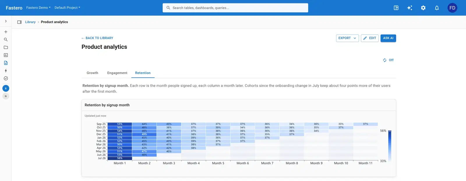
- Retention by signup month, with a note on what changed
The charts that matter, and how they're worked out
Signups and activations per week
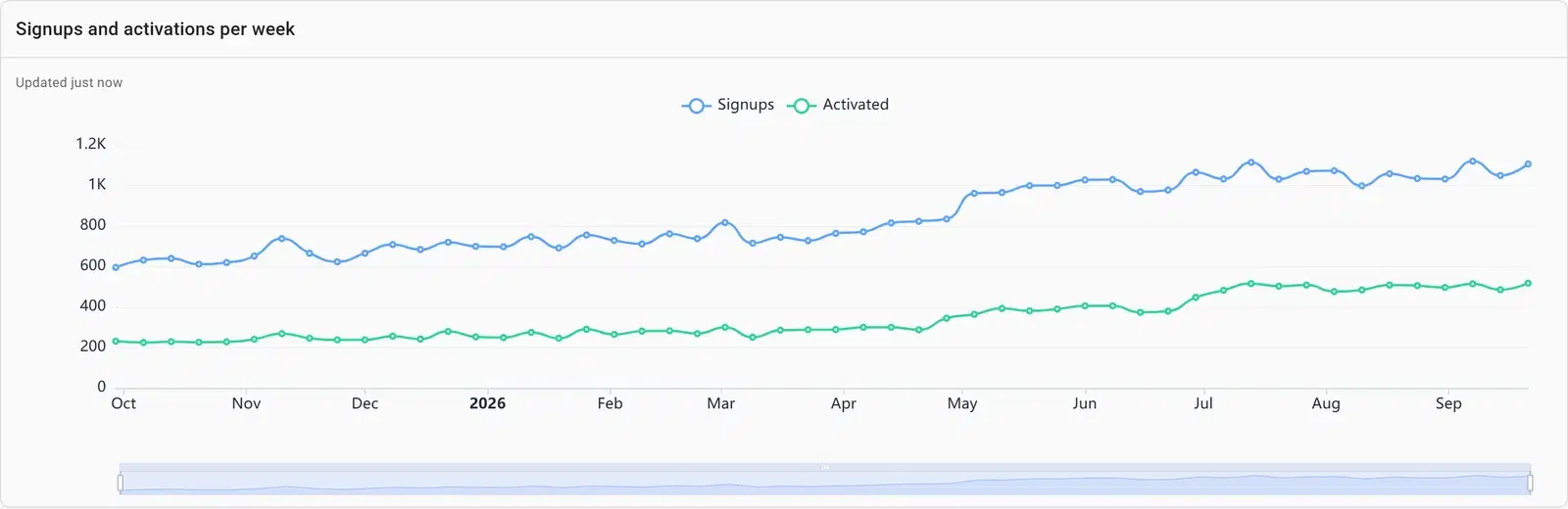
Signups alone flatter a product. Plotting activations — people who reached the first useful moment — on the same weeks shows how many of them were worth having.
SELECT date_trunc('week', day) AS week,
       round(100.0 * sum(activated) / sum(signups), 1) AS activation_rate
FROM signups_daily
GROUP BY 1
ORDER BY 1
Signup funnel, last 30 days
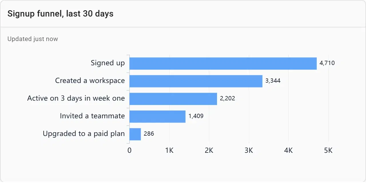
The funnel starts at signup, not at the site visit: beside every visitor, each later step would be a sliver. From signup on, the biggest drop between two steps is the one to work on.
Feature adoption last week
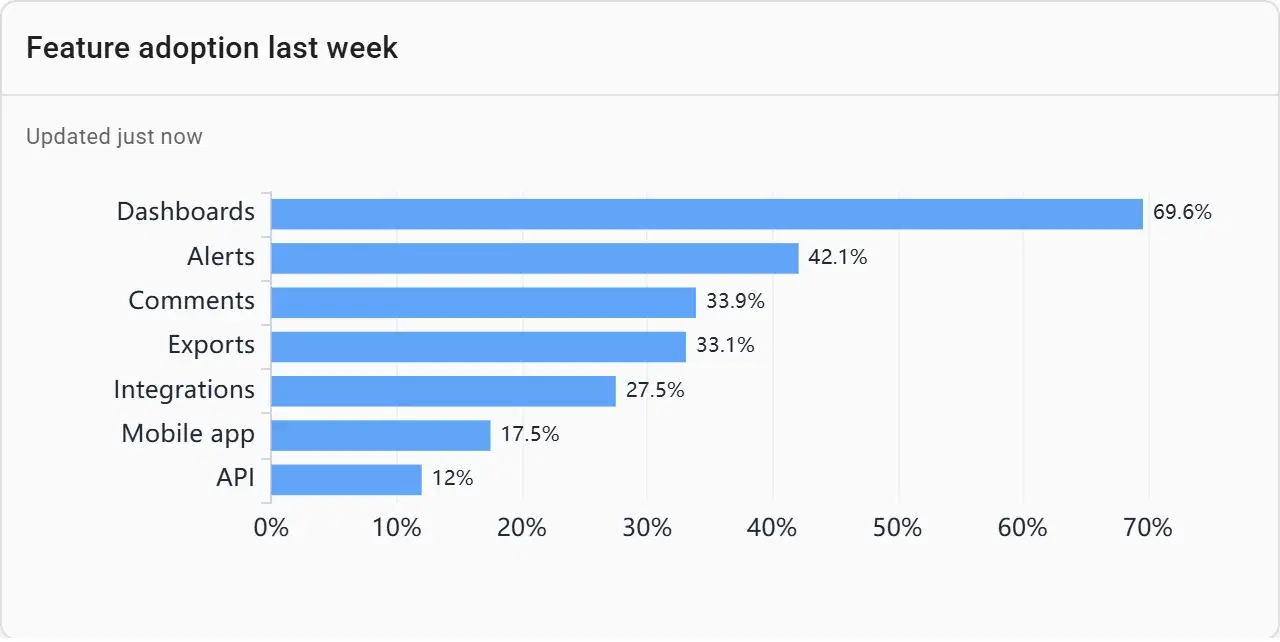
Adoption as a share of weekly active users, not a raw count, so a feature’s number doesn’t rise just because the product grew.
Workspaces: seats and weekly actives
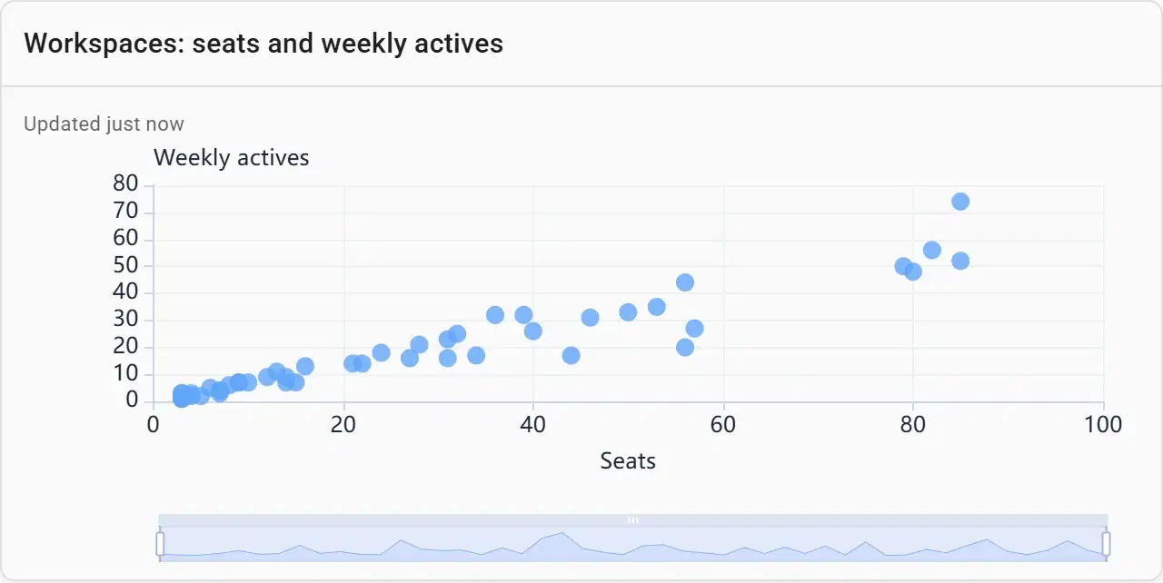
For a product sold by the seat, the gap between seats bought and seats used is next year’s churn. Workspaces far below the diagonal are the accounts to call.
Build one from your data
- Connect your database or upload a file in Fastero — or point Claude at it through Fastero's connector.
- Paste the prompt below, with your own table and column names.
- Check the numbers against a figure you trust, and adjust any chart by asking or by editing it.
- Share it with your team, or schedule it to arrive by email.
Build a SaaS product dashboard with three tabs. Growth: weekly active users, new signups per week, activation rate and the share of users kept after one month as number cards; signups and activations per week; signups by source; and the signup funnel for the last 30 days. Engagement: feature adoption as a share of weekly actives, active users by plan and by country, and workspaces by seats and weekly actives. Retention: retention by signup month as a heatmap.
What makes a good saas dashboard
Activation over signups
Define the moment a new user first gets value — a first report, a first invite — and report the share who reach it.
Shares, not counts, for adoption
Divide feature users by weekly actives, or growth makes every feature look like a hit.
Start the funnel at signup
Visitors dwarf every later step. Show the site’s traffic elsewhere and keep the funnel to the steps you can change in the product.
Seats in use for B2B
Weekly actives against seats per workspace is an early warning that a renewal is at risk.
Retention gets its own tab
It changes slowly and needs a cohort view to read properly. See the cohort retention example.
Questions people ask
What metrics should a SaaS dashboard include?
Weekly or monthly active users, new signups, activation rate, retention after the first month, feature adoption as a share of active users, and — for products sold by the seat — seats in use. Revenue metrics such as MRR and churn usually come from billing data on a separate tab.
How do you calculate activation rate?
Divide the users who reached your activation moment by the users who signed up in the same period. Pick the moment that predicts staying, such as a first completed task or a first invite, and keep the definition fixed.
How do I measure feature adoption?
Count the distinct users who used the feature in a week and divide by that week’s active users. Tracking it from the launch week shows whether adoption keeps climbing or stalls.
Can I build this from my product database?
Yes. Connect the database that holds your events and accounts, paste the prompt above into Fastero, and adjust the definitions of active and activated to match your product.
More dashboard examples
Your data, this dashboard, in minutes.
Connect a database or upload a file, describe the dashboard, and share it with your team. Free plan, no card needed.