Dashboard example
KPI Dashboard Examples: Five Rows of KPIs From Real Dashboards, and How to Choose Yours
The top row of number cards is the part of a dashboard most people read, and often the only part. Here are the KPI rows from five real dashboards, what each one chose to show, and the small decisions — what to compare against, which direction is good, how a number adds up over a quarter — that make a KPI card honest.
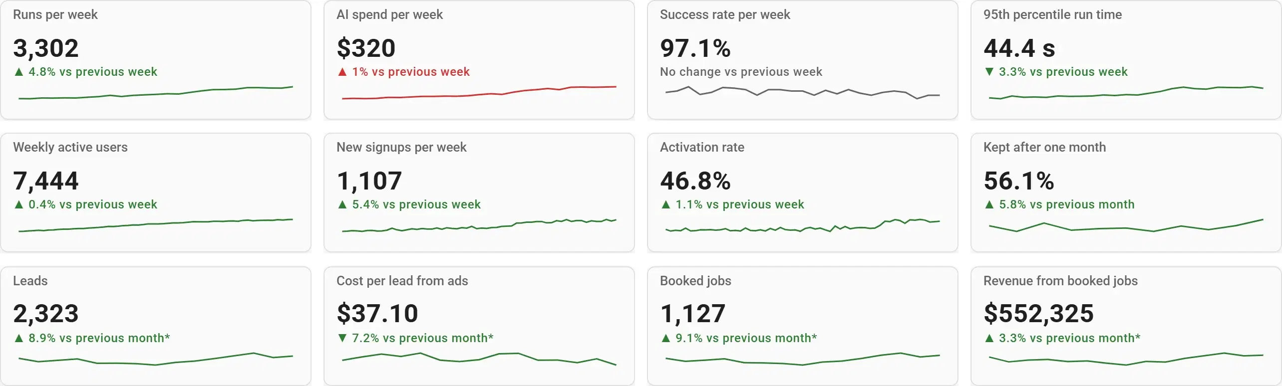
What's on it
Each row comes from a different invented business in Fastero’s demo workspace, built from saved SQL queries.
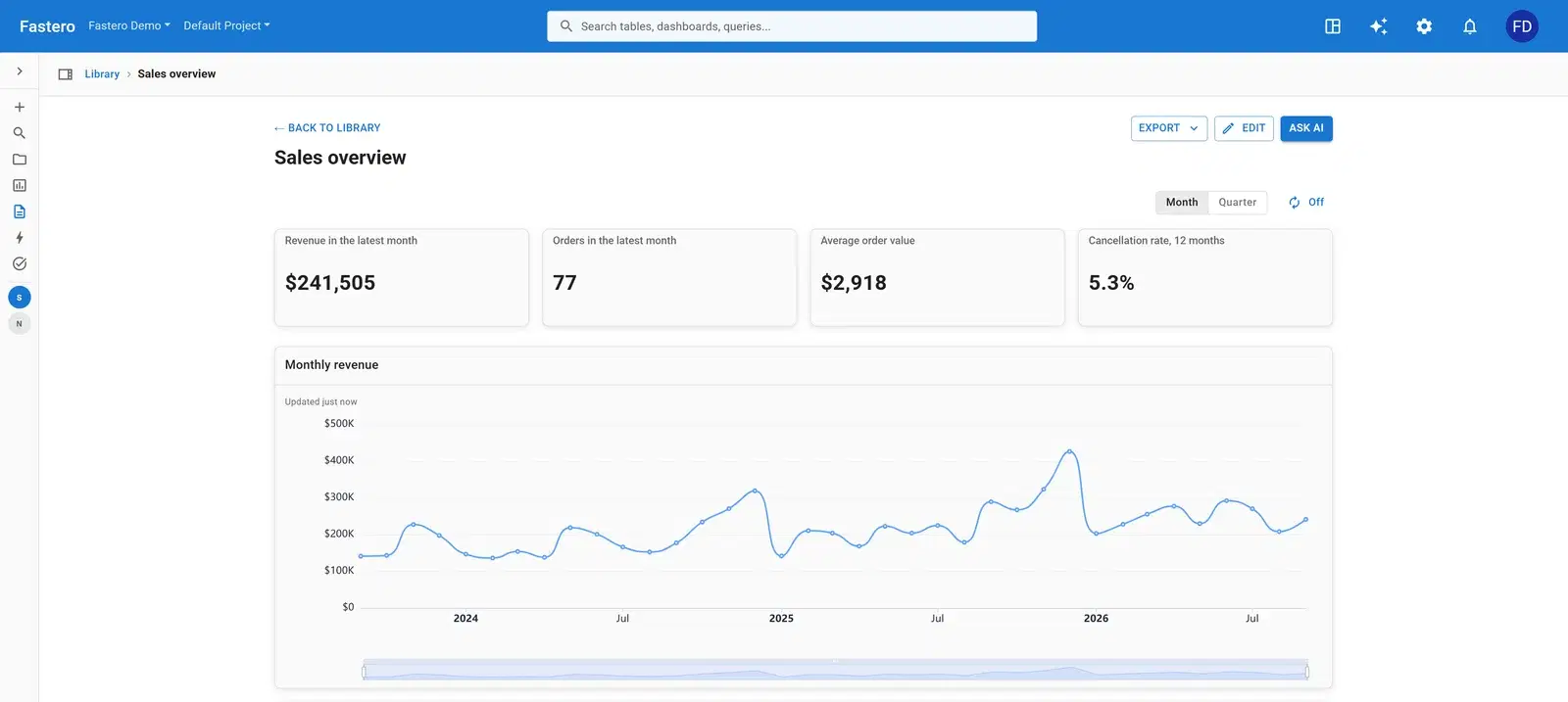
Sales
- Revenue in the latest month
- Orders in the latest month
- Average order value
- Cancellation rate, 12 months
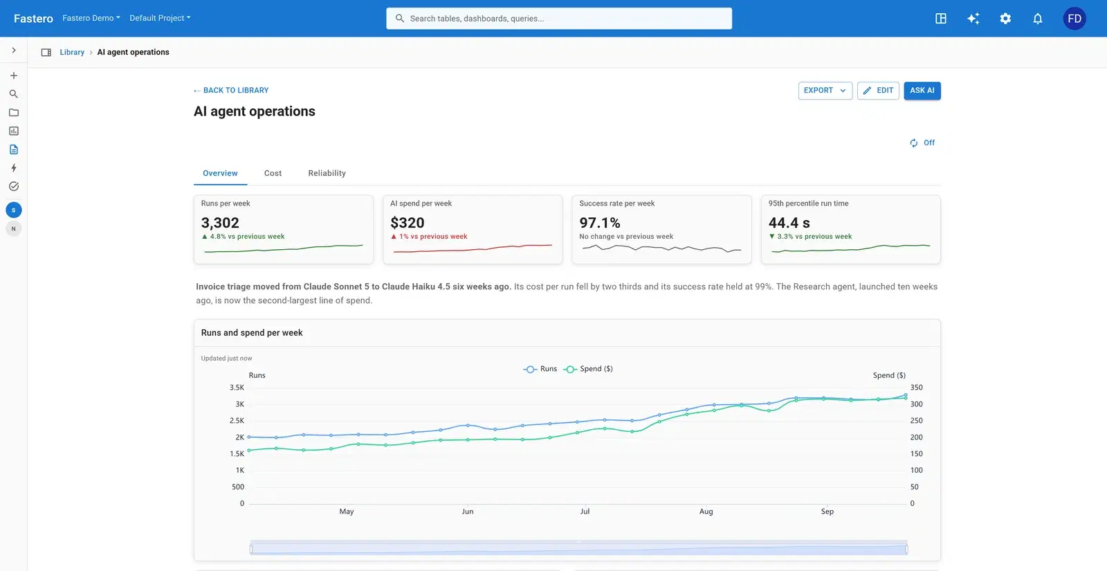
AI agents
- Runs per week
- AI spend per week
- Success rate per week
- 95th percentile run time
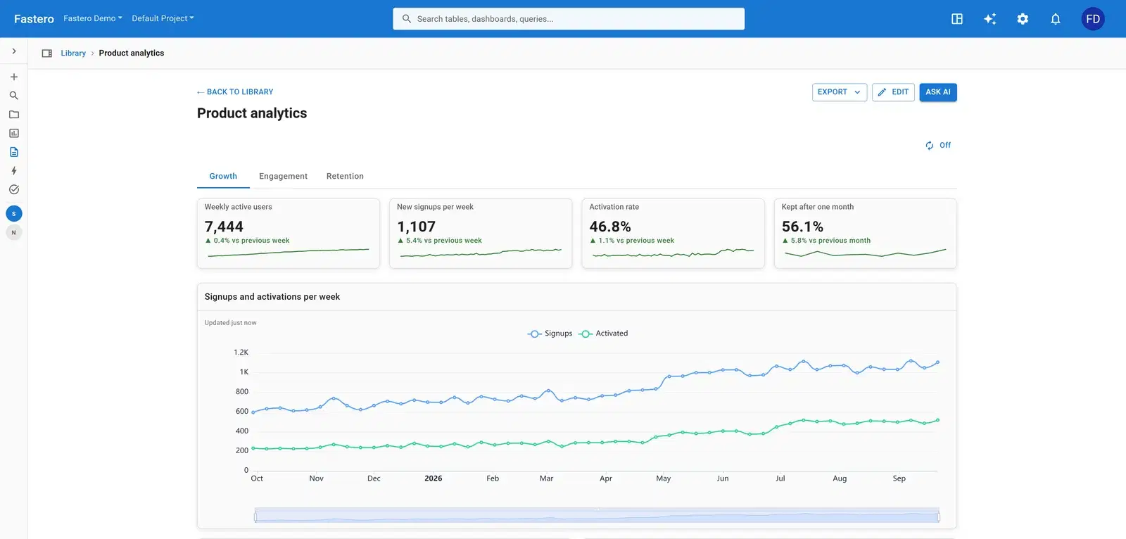
SaaS product
- Weekly active users
- New signups per week
- Activation rate
- Kept after one month
Client report
- Leads
- Cost per lead from ads
- Booked jobs
- Revenue from booked jobs
Solar fleet
- Generated per week
- Share of use met by solar
- Open alerts
The charts that matter, and how they're worked out
AI agents: how much they do, what it costs, how well they work

Runs and spend grow with use; the success rate and the 95th percentile run time say whether the agents work well. Spend and run time are lower-is-better numbers, so a rise in either shows in red and a fall in green: the colour follows whether a change is good, not which way it goes.
Sales: what the business is judged on

Revenue, orders, average order and cancellations. Three of them grow with the business; the cancellation rate is the one that should fall, and it covers twelve months so a single bad week doesn’t swing it.
SELECT round(SUM(i.quantity * i.unit_price)) AS revenue
FROM orders o JOIN order_items i USING (order_id)
WHERE o.status = 'completed'
  AND date_trunc('month', o.ordered_at) =
      (SELECT date_trunc('month', max(ordered_at)) FROM orders)
SaaS product: growth and whether it sticks

Weekly actives and signups say the product is growing; activation and the share kept after a month say the growth is real. Over a quarter, weekly actives show the last week’s value — adding thirteen weeks of active users together would count the same people thirteen times.
Client report: from spend to revenue

Leads, what each lead costs, the jobs they turned into and the revenue. Cost per lead is a lower-is-better number, so a fall shows in green and a rise in red, and over a longer period it averages rather than adds.
Solar fleet: output, value and problems

Three cards are enough when the third is an alarm. Open alerts has no trend to admire: it should be zero, and anything else is the first thing to read.
Build one from your data
- Connect your database or upload a file in Fastero — or point Claude at it through Fastero's connector.
- Paste the prompt below, with your own table and column names.
- Check the numbers against a figure you trust, and adjust any chart by asking or by editing it.
- Share it with your team, or schedule it to arrive by email.
Add a row of KPI cards to the top of this dashboard: revenue, orders and average order value for the latest month, and the cancellation rate over 12 months. Show each against the previous period, mark cancellations as lower-is-better, and add a small trend line under each.
What makes a good kpi dashboard
Three to five KPIs
A row that fits on one line on a laptop. Anything that doesn’t make the cut goes into the charts below.
Compare every number
Show the change since the previous period, or a target. A number with nothing to compare to can’t be judged.
Know which way is good
For spend, cost per lead, run time and churn, down is good. Colour the change accordingly, or the dashboard cheers the wrong thing.
Decide how a KPI adds up
Signups add up over a quarter; active users, rates and run times don’t. Show the last value or the average when the period gets longer.
One definition, written down
Store the query behind each KPI once and reuse it, so the card, the board deck and the monthly report agree.
Questions people ask
What is a KPI dashboard?
A dashboard built around a handful of key performance indicators — the numbers a team or business is judged on — each shown with its change over time, usually as a row of cards at the top with supporting charts below.
How many KPIs should a dashboard have?
Three to five on the top row. More than that and nobody reads them; the rest belong in charts further down or on another tab.
What makes a good KPI card?
A clear name, the current value, the change since the previous period coloured by whether that change is good, a small trend line, and a definition that stays the same from week to week.
Can I build a KPI dashboard from my database?
Yes. Connect your database to Fastero and ask for the KPIs you want in plain English; the AI writes the queries and lays out the cards, and you can adjust any of them.
More dashboard examples
Your data, this dashboard, in minutes.
Connect a database or upload a file, describe the dashboard, and share it with your team. Free plan, no card needed.