Dashboard example
AI Agent Dashboard Example: Runs, Cost, Speed and Failures for Agents in Production
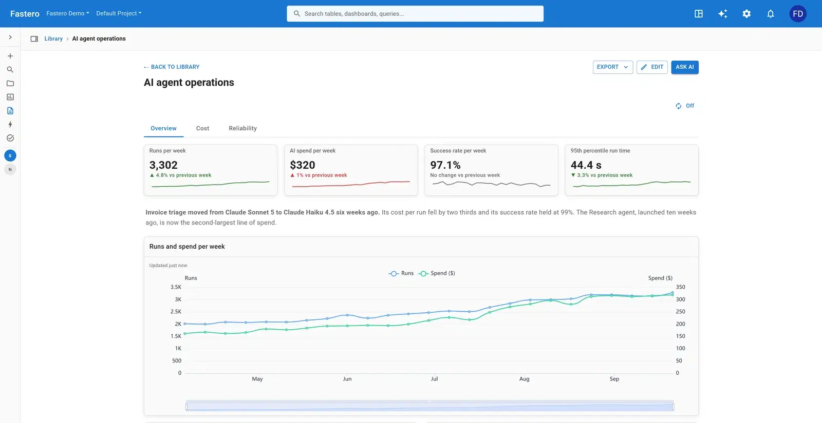
Once AI agents run in production, someone has to answer three questions every week: how much are they doing, what does it cost, and how often do they fail? This dashboard answers all three for five invented agents — a support assistant, a SQL analyst, invoice triage, a code reviewer and a research agent — from one table of runs.
What's on it
One row per run: the agent, the model, the status, the run time in milliseconds, the cost in dollars and when it started. A second table counts tool calls and tool errors per day.
Overview
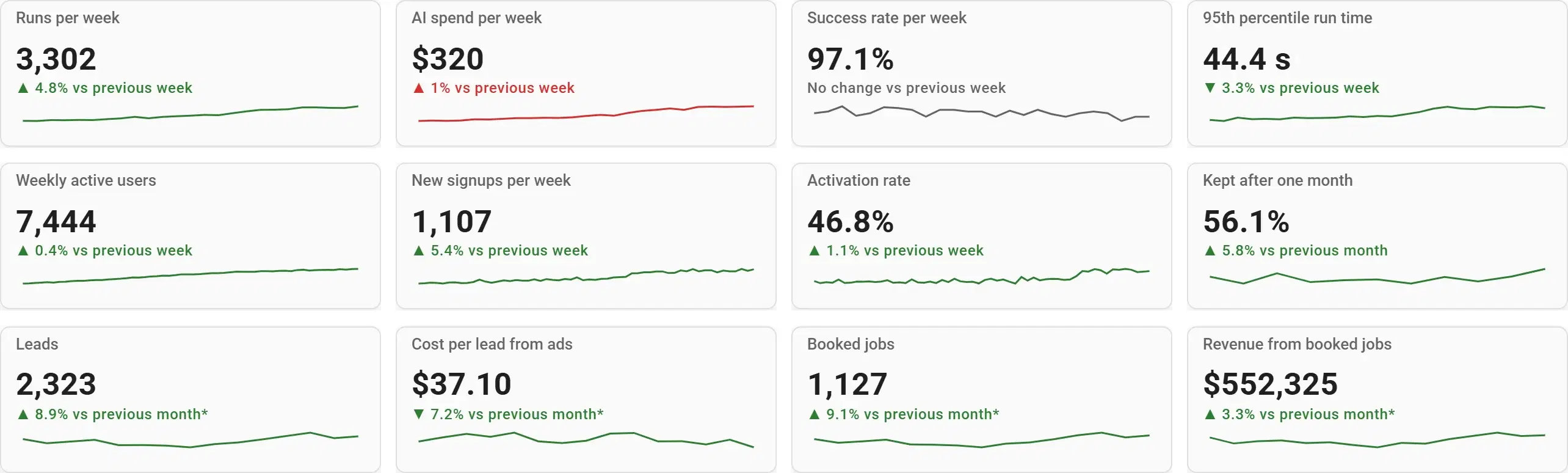
- Runs per week
- AI spend per week
- Success rate per week
- 95th percentile run time
- A written note on what changed
- Runs and spend per week
- Runs per week by agent
- Spend by model, last 30 days
Cost
- Change in spend by agent, last 30 days
- Spend by agent, last 30 days
- Cost per run, by agent
- Weekly spend and cost per run
- Agents at a glance (runs, success, cost per run, run time)
Reliability
- Failed runs per day, by agent
- Tool error rate, last 30 days
- Runs by hour and weekday
The charts that matter, and how they're worked out
Cost per run, by agent
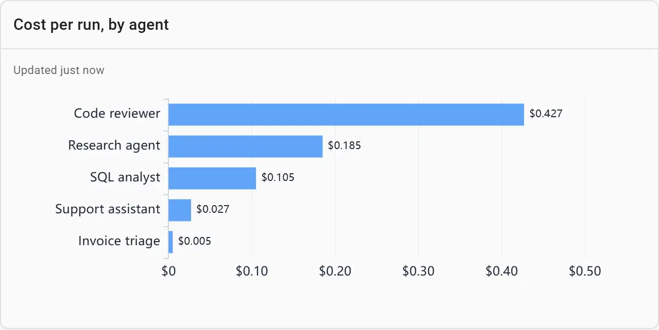
Total spend grows with usage, which is fine. Cost per run is the number that says whether an agent got more expensive to operate — after a prompt change, a longer context or a model switch.
SELECT agent, round(avg(cost_usd), 3) AS cost_per_run
FROM runs
WHERE started_at >= CURRENT_DATE - 30
GROUP BY agent
ORDER BY cost_per_run
Spend by model, last 30 days
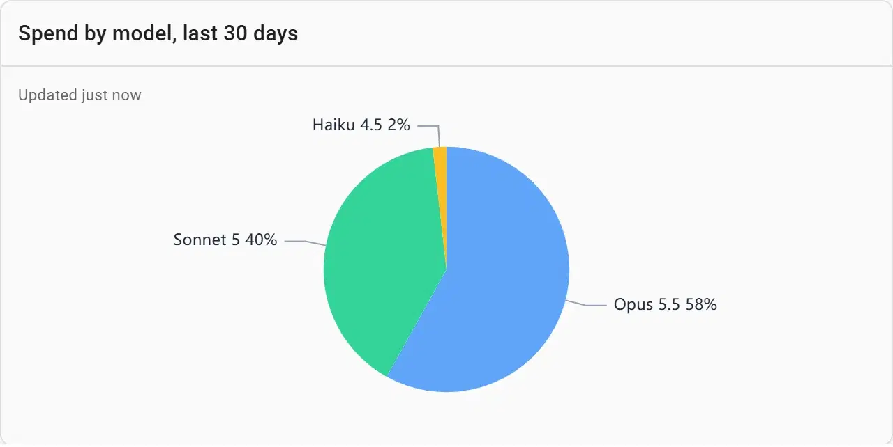
Most of the bill usually sits with one model. When the note on the overview says an agent moved from Claude Sonnet 5 to Claude Haiku 4.5, this is where the shift shows.
Tool error rate, last 30 days
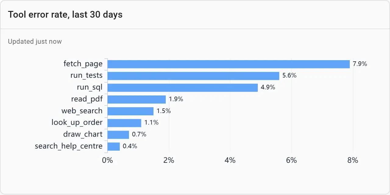
Agents rarely fail on their own; a tool they call does. The eight tools that fail most, each named, point at the integration to fix first.
Runs by hour and weekday
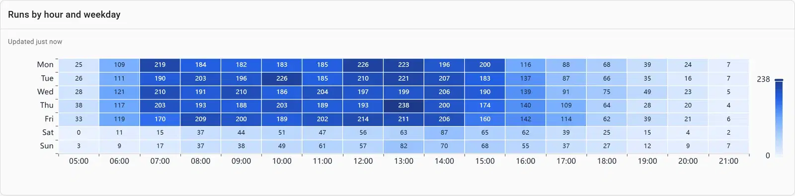
When agents run decides when they can be updated safely and when rate limits bite. A heatmap of the last four weeks shows the busy hours at a glance.
Build one from your data
- Connect your database or upload a file in Fastero — or point Claude at it through Fastero's connector.
- Paste the prompt below, with your own table and column names.
- Check the numbers against a figure you trust, and adjust any chart by asking or by editing it.
- Share it with your team, or schedule it to arrive by email.
From our agent runs table (agent, model, status, latency_ms, cost_usd, started_at), build an agent operations dashboard with three tabs. Overview: runs, spend, success rate and 95th percentile run time per week as number cards with the change since last week, runs and spend per week, runs per week by agent and spend by model. Cost: spend and cost per run by agent, and the change in spend over the last 30 days. Reliability: failed runs per day by agent, tool error rates and runs by hour and weekday.
What makes a good ai agent dashboard
Log one row per run
Agent, model, status, run time, cost and start time cover every chart here. Add the user or customer if you bill by them.
Watch cost per run, not just spend
Spend rising with usage is good news. Cost per run rising is a regression, and it usually follows a prompt or model change.
Use the 95th percentile for speed
An average hides the slow runs people complain about. The 95th percentile is the run time nineteen in twenty runs beat.
Write down what changed
A short note — "invoice triage moved to a smaller model six weeks ago" — turns a step in a chart from a mystery into a decision.
Split failures by agent and by tool
The agent tells you who is affected; the tool tells you what to fix.
Questions people ask
What should an AI agent dashboard track?
How much the agents do (runs), what it costs (total spend and cost per run, by agent and by model), how fast they are (95th percentile run time) and how often they fail (success rate, failures by agent, tool errors). Week-on-week changes on each make regressions visible.
How do I work out the cost of each agent run?
Record the tokens and the price of the model with each run, or the cost your provider reports, and store it on the run’s row. Average it by agent over the last 30 days for cost per run.
Is this the same as LLM observability?
It complements it. Tracing tools follow a single run step by step to debug it. This dashboard summarises all runs for the team, the budget owner and the weekly review, from the same run log.
Can Claude build this dashboard?
Yes. This one was built through Fastero’s MCP server, the same tools Claude uses through Fastero’s connector. Point Claude at your run log and paste the prompt above.
More dashboard examples
Your data, this dashboard, in minutes.
Connect a database or upload a file, describe the dashboard, and share it with your team. Free plan, no card needed.