Dashboard example
Executive Dashboard Example: Revenue, Orders and Where They Come From
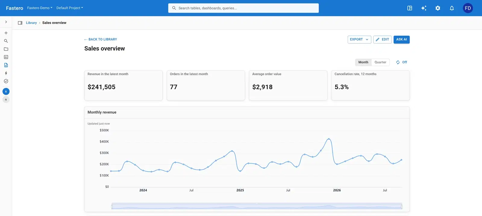
An executive dashboard answers one question in five seconds: how is the business doing? This one is a product company's sales overview — four numbers at the top, the revenue trend under them, and the breakdowns a leadership team asks about next, by channel, country, product and category.
What's on it
Four tables: orders (date, status, channel), order items (quantity, unit price), products (name, category) and customers (country, segment).
- Revenue in the latest month
- Orders in the latest month
- Average order value
- Cancellation rate, 12 months
- Monthly revenue
- Revenue by channel each quarter
- Orders by channel
- Revenue by country
- Revenue by product
- Orders by month and category
- Monthly revenue against its three-month average
- Revenue change by category, year on year
- Customers by units, revenue and orders
- Revenue by category
- Top products
The charts that matter, and how they're worked out
Monthly revenue against its three-month average
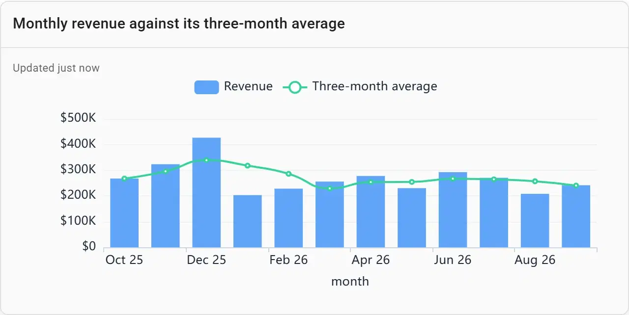
One noisy month starts a meeting-long debate. A three-month average drawn over the monthly bars shows whether the business is actually moving, and both series are revenue on one scale, so nothing reads as a correlation that isn’t there.
SELECT date_trunc('month', o.ordered_at) AS month,
       SUM(i.quantity * i.unit_price) AS revenue,
       round(avg(SUM(i.quantity * i.unit_price)) OVER (
         ORDER BY date_trunc('month', o.ordered_at)
         ROWS BETWEEN 2 PRECEDING AND CURRENT ROW)) AS three_month_average
FROM orders o JOIN order_items i USING (order_id)
WHERE o.status = 'completed'
GROUP BY 1
ORDER BY 1
Revenue change by category, year on year
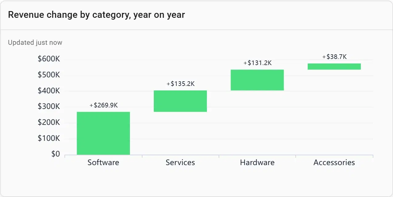
The question after "revenue is up" is "from what?". A waterfall splits the year-on-year change into the categories that drove it, growth and decline side by side.
Revenue by channel each quarter
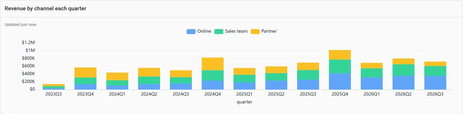
Quarters smooth out the monthly noise, and stacking the channels shows both the total and the mix: whether online, the sales team or partners carry the growth.
Top products
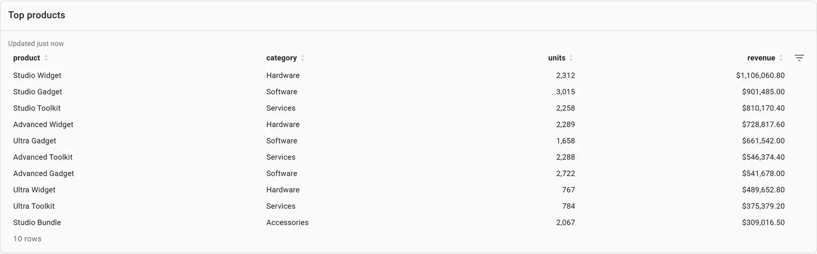
A table for the names behind the charts. Ten rows is enough for a leadership view; anything longer belongs in a drill-down.
Build one from your data
- Connect your database or upload a file in Fastero — or point Claude at it through Fastero's connector.
- Paste the prompt below, with your own table and column names.
- Check the numbers against a figure you trust, and adjust any chart by asking or by editing it.
- Share it with your team, or schedule it to arrive by email.
Build an executive dashboard from our orders data: revenue in the latest month, orders, average order value and the 12-month cancellation rate as number cards; monthly revenue with its three-month average; revenue by channel each quarter; the year-on-year change in revenue by category; and the top ten products. Add a month and quarter switch.
What makes a good executive dashboard
Four numbers, not twelve
The top row is what people read in five seconds. Pick the three or four numbers the business is judged on and push the rest further down.
Put the period in the name
"Revenue in the latest month", "Cancellation rate, 12 months": when the period is part of the title, nobody compares a month with a year by mistake.
Trend before breakdown
Show where the total is going first, then the cuts that explain it: channel, region, product.
Define the hard ones once
Write down what counts as revenue and what counts as cancelled, in the query, and reuse it — so the board deck and the dashboard agree.
One page and a period switch
A month and quarter switch keeps one dashboard useful for the weekly check-in and the quarterly review.
Questions people ask
What should an executive dashboard include?
Three or four headline numbers with their change since the last period, the trend of the most important one, and the breakdowns that explain it — typically by channel, region and product. Keep it to one page that reads in a few seconds.
How is an executive dashboard different from an operational one?
An executive dashboard summarises the whole business for decisions made weekly or monthly. An operational dashboard tracks one process in near real time — today’s orders, open tickets, failed jobs — for the people running it.
How often should an executive dashboard refresh?
Daily is usually enough. What matters more is that every number comes from the same saved queries each time, so the figure in Monday’s meeting matches the one on the dashboard.
Can I build this from my own database?
Yes. Connect your database to Fastero, ask for the dashboard in plain English using the prompt above, and adjust any chart. The queries are saved, so the dashboard runs them fresh each time someone opens it.
More dashboard examples
Your data, this dashboard, in minutes.
Connect a database or upload a file, describe the dashboard, and share it with your team. Free plan, no card needed.