Dashboard example
Energy Monitoring Dashboard Example: A Solar Fleet’s Output, Forecast and Alerts
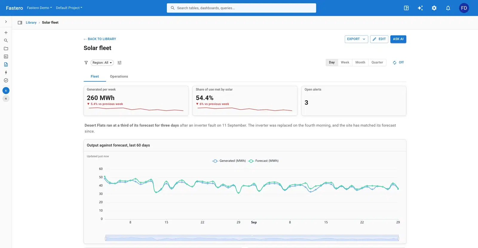
An energy dashboard has to separate weather from faults: a low day is normal, a low day at one site when the rest are fine is a problem. This one watches an invented fleet of twelve solar sites with batteries, across four regions, against each site’s day-ahead forecast.
What's on it
Hourly readings per site (energy generated and used, sunlight, battery charge), daily forecasts per site, the sites with their region, location and capacity, and an alerts table.
Fleet
- Generated per week
- Share of use met by solar
- Open alerts
- A note on what happened
- Output against forecast, last 60 days
- Output per day by region
- Fleet capacity factor, last 30 days
- Yield by site, last 30 days
- Sites, on a map
Operations
- One site’s output against forecast
- Average output by hour, by region
- Battery charge through the day
- Sunlight against output
- Alerts, open first
The charts that matter, and how they're worked out
Output against forecast, last 60 days
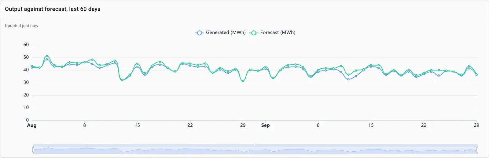
The forecast already knows about the weather, so the gap between the two lines is what’s left: faults, shading, curtailment. In this data, one site ran at a third of its forecast for three days after an inverter fault.
Fleet capacity factor, last 30 days
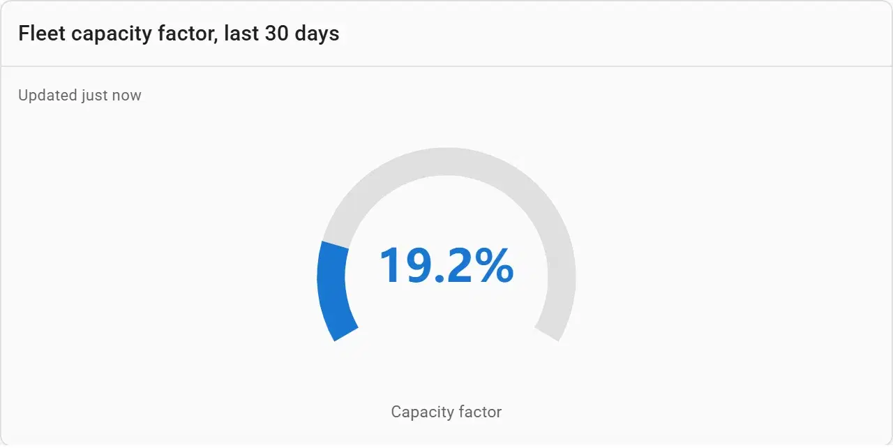
What the fleet produced as a share of what it could have produced running flat out — one number that compares a month in summer with a month in winter honestly.
Average output by hour, by region
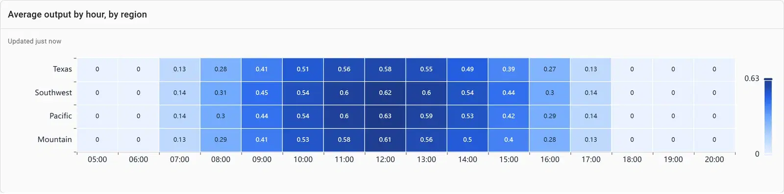
Output per kilowatt of capacity, so big and small sites compare fairly, by hour of the day. A region that peaks later or lower than the rest stands out at once.
SELECT s.region,
       extract(hour FROM r.reading_at) AS hour,
       round(avg(r.generated_kwh / s.capacity_kw), 3) AS kwh_per_kw
FROM readings r JOIN sites s USING (site_id)
WHERE r.reading_at >= CURRENT_DATE - 14
  AND extract(hour FROM r.reading_at) BETWEEN 5 AND 20
GROUP BY 1, 2
ORDER BY 1, 2
Sites
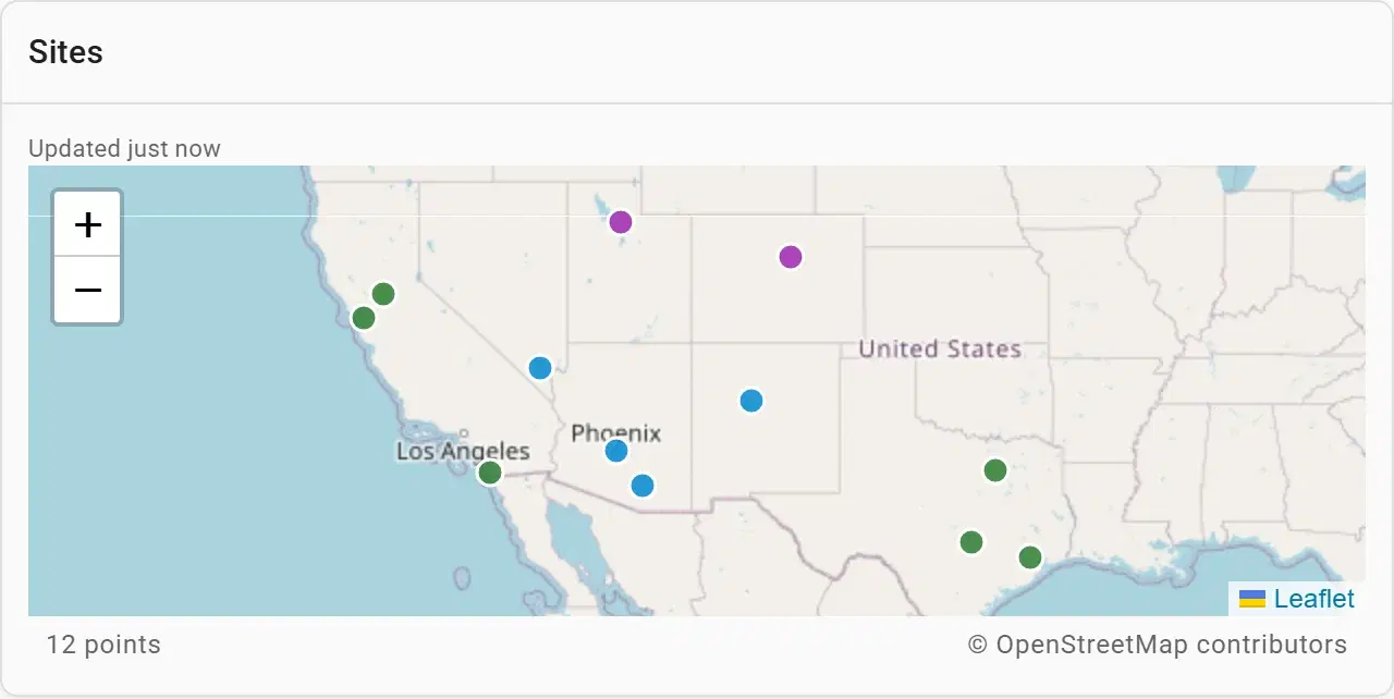
Where each site is, coloured by region. When three sites in one area dip together, it’s weather; when one dips alone, it’s the site.
The same data in a Streamlit app and a notebook
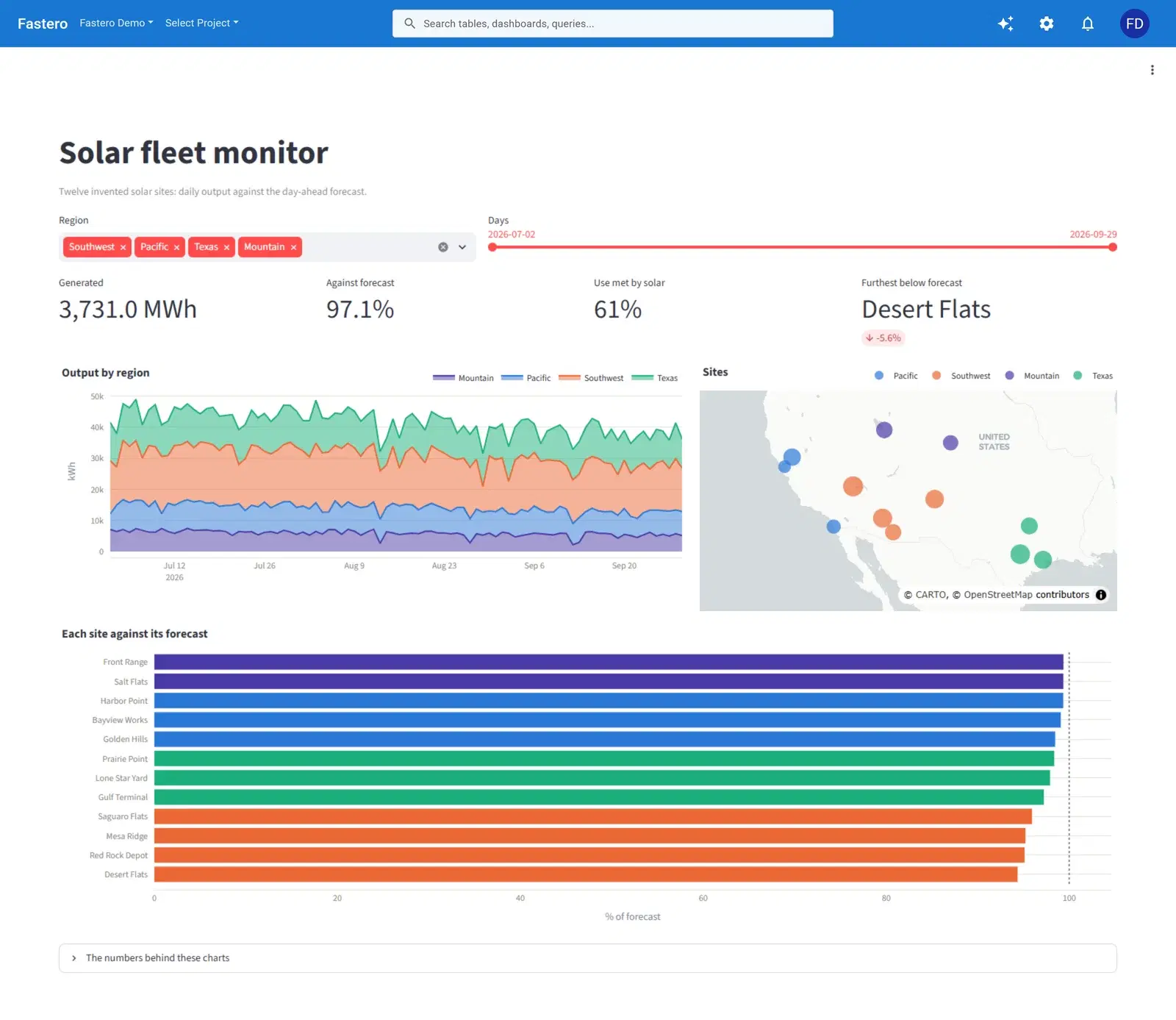
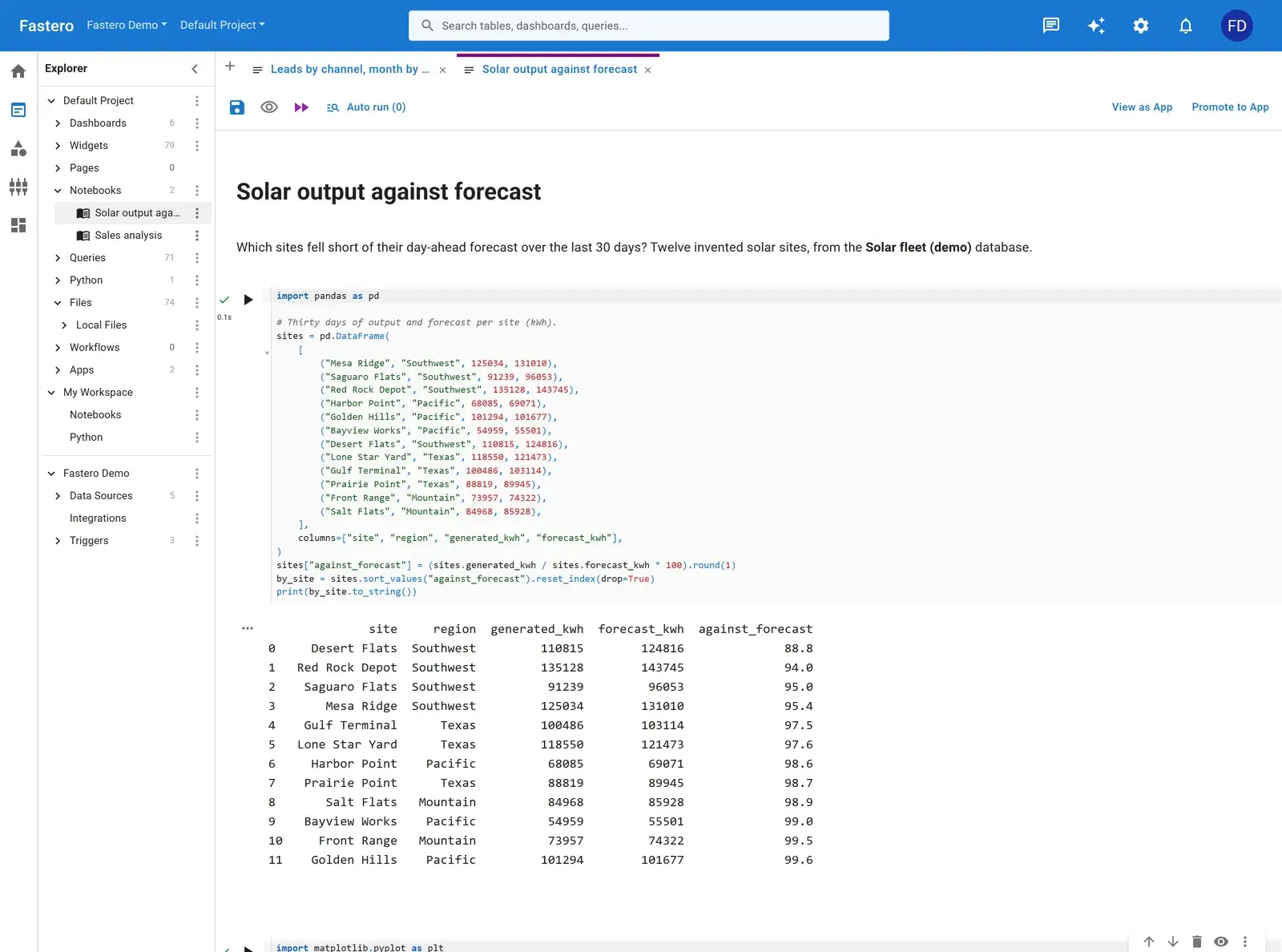
The data team behind this fleet doesn’t only use the dashboard. The same readings feed a Streamlit app the operations team filters by region and date, and a Jupyter notebook that compares output with the forecast — all three in one Fastero workspace, behind the same login.
Build one from your data
- Connect your database or upload a file in Fastero — or point Claude at it through Fastero's connector.
- Paste the prompt below, with your own table and column names.
- Check the numbers against a figure you trust, and adjust any chart by asking or by editing it.
- Share it with your team, or schedule it to arrive by email.
From our solar readings (site_id, reading_at, generated_kwh, consumed_kwh, battery_pct), daily forecasts and sites tables, build a fleet dashboard with two tabs. Fleet: energy generated per week, the share of use met by solar and open alerts as number cards; output against forecast for the last 60 days; output per day by region; the fleet capacity factor; yield by site; and the sites on a map. Operations: average output by hour and region, battery charge through the day and the alerts table. Add a region filter.
What makes a good energy monitoring dashboard
Compare with the forecast
Totals rise and fall with the weather. The gap to the forecast is what someone can act on.
Normalise by capacity
kWh per kW of capacity lets a 200 kW roof and a 5 MW field share a chart.
Alerts open first
Sort the alerts table with unresolved ones at the top, and keep the open count on the top row.
Time of day matters
An hour-by-region heatmap shows shading, soiling and inverter clipping that a daily total hides.
Say what happened
A one-line note — a fault, a replacement, a change — saves the next reader from rediscovering it.
Questions people ask
What should an energy monitoring dashboard show?
Energy produced and used, production against the forecast, a capacity-normalised measure such as capacity factor or yield so sites compare fairly, output by time of day, and open alerts — with a map when sites are spread out.
What is capacity factor?
The energy a site or fleet produced in a period divided by what it would have produced running at full capacity the whole time. It makes different sizes and seasons comparable.
Can I build this from my own meter or SCADA data?
Yes, once the readings land in a database such as Postgres. Connect it to Fastero, paste the prompt above and adjust the table and column names.
Can the operations team use an app instead of a dashboard?
Yes. Fastero hosts Streamlit apps and notebooks next to dashboards, behind the same login, so the same data can serve a dashboard, an interactive app and an analysis notebook.
More dashboard examples
Your data, this dashboard, in minutes.
Connect a database or upload a file, describe the dashboard, and share it with your team. Free plan, no card needed.