
Most dashboards fail for the same reason: they're built from the data that happens to be available, not from a question someone needs answered. This guide goes the other way round, from the question to the finished page, with pictures of real dashboards built in Fastero on invented data.
The short answer: to create a dashboard, (1) decide who reads it and what it must answer, (2) pick three to five KPIs and define each one, (3) get the data into one place, (4) write one query per chart, (5) choose the chart that fits each question, (6) lay it out with numbers on top, the main trend next and breakdowns below, and (7) share it and keep it current. Or describe it to an AI and let it do steps 3 to 6 — then check its work.
Step 1: Decide who reads it and what it must answer
Write one sentence: "Every Monday, the leadership team needs to see whether sales are on track and where they come from." That sentence decides everything else: the period (weekly), the depth (headline numbers, then a few breakdowns) and what to leave out.
A dashboard for the people running a process is different from one for the people judging it. An operations dashboard shows today's queue, failures and alerts; an executive dashboard shows the month's results and their drivers. Trying to serve both on one page serves neither.
Step 2: Pick three to five KPIs and define each one
The top row of number cards is the part everyone reads, often the only part. Choose the three to five numbers the reader is judged on, and write down exactly what each means:
- Revenue: completed orders only? Before or after refunds? By order date or payment date?
- Active user: someone who logged in, or someone who did something useful?
- Cost per lead: ad spend divided by all leads, or only the leads from paid channels?
Show each KPI against something — the previous period or a target — and decide which direction is good. For spend, run times and cancellations, down is good, so a fall should show in green and a rise in red:

KPI cards from an AI agent dashboard in Fastero: spend rose, so it shows red; run time fell, so it shows green. Sample data.
More rows like this, and how each was chosen, in KPI dashboard examples.
Fastero
Connect your database. Ask questions. Get dashboards.
Postgres, BigQuery, Snowflake, and 10+ sources — live-connected, AI-powered, no dashboard builder learning curve.
Try free →Step 3: Get the data into one place
A dashboard reads from a source: a database such as Postgres or MySQL, a warehouse, a Google Sheet or an uploaded file. If the numbers live in several systems, either move them into one database first or use a tool that can query more than one source.
Two rules save a lot of pain later:
- Read from the source, don't paste numbers in. A dashboard built on copied figures is out of date the day after.
- Use a read-only login. A dashboard never needs to write to your database.
Step 4: Write one query per chart
Each chart answers one question, so it gets one query. Keep the definitions from step 2 inside the queries, and reuse them rather than rewriting them chart by chart. Here is a revenue KPI written that way — completed orders only, in the latest month:
SELECT round(SUM(i.quantity * i.unit_price)) AS revenue
FROM orders o JOIN order_items i USING (order_id)
WHERE o.status = 'completed'
  AND date_trunc('month', o.ordered_at) =
      (SELECT date_trunc('month', max(ordered_at)) FROM orders)
Save the queries with names people understand — "Revenue in the latest month", not "q_rev_v2" — because those names become the chart titles.
Step 5: Choose the chart that fits each question
| The question | The chart |
|---|---|
| How is it changing over time? | Line chart (or bars for a few periods) |
| Which is biggest? | Bar chart, sorted, horizontal when labels are long |
| What makes up the total, over time? | Stacked bars |
| Is the trend real or noise? | Bars with a moving-average line |
| What drove the change? | Waterfall |
| Where is it happening? | Map |
| When does it happen? | Heatmap of hour by weekday |
| How do two measures relate? | Scatter plot |
| Which items, exactly? | Table, ten rows or fewer |
Pie charts work for two to four parts and little else. A gauge works for one number with a clear maximum, such as a capacity factor.
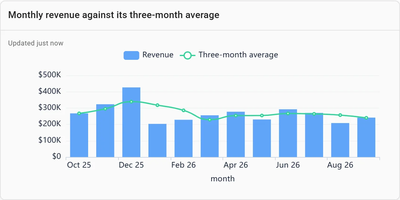
Bars with a moving average: is the trend real or noise? Sample data.
Step 6: Lay it out so it reads top to bottom
A layout that works for almost every dashboard:
- Numbers first, in one row.
- The main trend, full width, right under them.
- Breakdowns in pairs below: by channel, region, product.
- Tables last, for the people who need the names.
Then add the two controls people use most. A period switch regroups the charts over time by day, week, month or quarter, so one dashboard serves the weekly check-in and the quarterly review:

A period switch regrouping every chart at once. Sample data.
And filters that apply across the page, or clicking a bar to filter everything else by it:

Click a bar to filter the whole dashboard. Sample data.
When a dashboard outgrows one page, split it into tabs by question — overview, cost, reliability — rather than scrolling forever.

Tabs keep a large dashboard readable. Sample data.
Step 7: Share it and keep it current
A dashboard nobody opens is a report nobody reads. Three things keep it alive:
- Put it where people already are. Invite the readers so they open it with their own login, and schedule it by email for the people who won't — a PDF every Monday morning, run fresh that day.
- Keep it current. Run the queries fresh when it opens, and refresh it on a timer or when the data changes, so the numbers on screen are today's.
- Add a sentence. A short note at the top — what changed and why — is the part most readers remember.
The fast way: describe it, then check it
Steps 3 to 6 are where most of the hours go, and they're what an AI can do well. In Fastero you connect the data, describe the dashboard in plain English, and the AI writes the queries, picks the charts and lays them out:
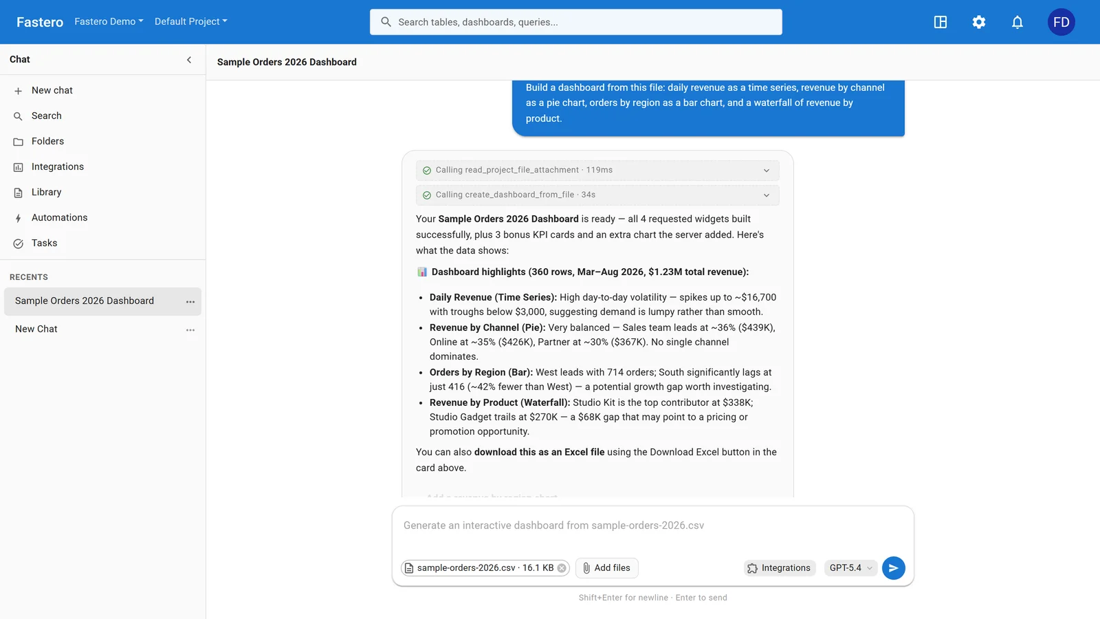
Asking for a dashboard in Fastero. Sample data.
Build a weekly sales dashboard from our orders table: revenue, orders and average order value as number cards with the change since last week, revenue by month with its three-month average, revenue by channel each quarter, and the top ten products. Add a month and quarter switch.
Steps 1, 2 and 7 stay yours: the AI can't know who reads the dashboard or what your business counts as revenue. Check each number against a figure you trust before you share it. For seven finished dashboards with their prompts and SQL, see the dashboard examples.
FAQ
What are the steps to create a dashboard?
Decide the reader and the question; choose three to five KPIs and define them; connect the data; write one query per chart; pick the chart for each question; lay it out with numbers first, the main trend next and breakdowns below; then share it and keep it current.
How many charts should a dashboard have?
Enough to answer its question and no more — usually three to five number cards and four to eight charts. If it needs more, split it into tabs by question.
What is the best way to create a dashboard for free?
Use a tool with a free plan that connects to your data directly, so the dashboard stays current without copying numbers. Fastero's Free plan builds dashboards from a database, a Google Sheet or a file, and has no time limit.
Can AI create a dashboard for me?
Yes. Tools such as Fastero connect to your data, take a plain-English description and build the queries, charts and layout. Check the numbers against a figure you trust before you share the result.
What makes a dashboard good?
It answers one reader's question at a glance, every number has a definition and a comparison, the layout reads top to bottom, and it's current when people open it.
Related reading:
- Dashboard examples: 7 real dashboards with their SQL and prompts
- KPI dashboard examples
- Best free dashboard tools (2026)
Try Fastero free — connect your data, describe the dashboard, and share it with your team. No credit card required.