
Streamlit turns a Python script into a web app: no HTML, no JavaScript, no callbacks to wire. The fastest way to learn what it can do for a dashboard is to read a few that work.
The short answer: below are eight complete Streamlit dashboards, each a single file under 40 lines. Six run with invented data, so you can try them in a minute; the database example needs a connection string, and the login example needs a sign-in provider. All eight were run on Streamlit 1.65 (October 2026) before publishing.
| # | Example | Streamlit features | Good for |
|---|---|---|---|
| 1 | KPI overview | st.metric, st.line_chart, st.cache_data |
A weekly numbers page |
| 2 | Sidebar filters | st.sidebar, st.multiselect, st.date_input, st.bar_chart |
Slicing orders by region and date |
| 3 | Click to drill down | st.plotly_chart(on_select=...) |
Going from a chart to the rows behind it |
| 4 | Editable budget | st.data_editor, st.column_config |
Planning with a team |
| 5 | CSV explorer | st.file_uploader, st.selectbox |
Spreadsheets people email around |
| 6 | Self-refreshing panel | st.fragment(run_every=...) |
A wallboard or live counter |
| 7 | Live database query | st.connection, st.secrets |
Dashboards on real data |
| 8 | Behind a login | st.login, st.user |
Anything that isn't public |
How to run them
Install Streamlit and the libraries the examples use, save one as app.py, and start it:
pip install streamlit pandas numpy plotly
streamlit run app.py
Streamlit opens the app at http://localhost:8501 and reloads it whenever you save the file.
1. A KPI overview
The dashboard most teams start with: three numbers with their change since last month, and the trend underneath. st.metric draws the delta arrows for you, and @st.cache_data keeps the data from reloading on every click.
import numpy as np
import pandas as pd
import streamlit as st

st.set_page_config(page_title="Sales overview", layout="wide")


@st.cache_data
def load_sales():
    rng = np.random.default_rng(7)
    months = pd.date_range("2025-01-01", periods=21, freq="MS")
    revenue = (120_000 + np.arange(21) * 4_000 + rng.normal(0, 9_000, 21)).round()
    orders = (revenue / rng.uniform(85, 95, 21)).round()
    return pd.DataFrame({"month": months, "revenue": revenue, "orders": orders})


sales = load_sales()
this, last = sales.iloc[-1], sales.iloc[-2]

st.title("Sales overview")
a, b, c = st.columns(3)
a.metric("Revenue", f"${this.revenue:,.0f}", f"{this.revenue / last.revenue - 1:+.1%}")
b.metric("Orders", f"{this.orders:,.0f}", f"{this.orders - last.orders:+,.0f}")
c.metric("Average order", f"${this.revenue / this.orders:,.2f}")

st.line_chart(sales, x="month", y="revenue")
Swap load_sales() for a query; keep the cache decorator so the page stays fast.
Fastero
Host your Streamlit app for your team.
Deploy from GitHub with your team's login and secrets built in — no Docker, no auth proxy.
Try free →2. Filters in the sidebar
Region and date filters drive the total, a weekly stacked bar chart and the table of orders. Everything inside with st.sidebar: lands in the collapsible left panel, and the whole script reruns with the new values each time someone changes a filter.
import numpy as np
import pandas as pd
import streamlit as st


@st.cache_data
def load_orders():
    rng = np.random.default_rng(1)
    n = 2_000
    return pd.DataFrame({
        "date": pd.Timestamp("2026-01-01") + pd.to_timedelta(rng.integers(0, 280, n), unit="D"),
        "region": rng.choice(["North", "South", "East", "West"], n),
        "product": rng.choice(["Basic", "Pro", "Team"], n, p=[0.5, 0.35, 0.15]),
        "amount": rng.gamma(2.0, 60.0, n).round(2),
    })


orders = load_orders()
all_regions = sorted(orders.region.unique())

with st.sidebar:
    st.header("Filters")
    regions = st.multiselect("Region", all_regions, default=all_regions)
    dates = st.date_input("Dates", (orders.date.min().date(), orders.date.max().date()))

if len(dates) != 2:
    st.stop()  # the user has picked a start date but not yet an end date

start, end = dates
picked = orders[orders.region.isin(regions) & orders.date.dt.date.between(start, end)]

st.title("Orders")
st.metric("Revenue in range", f"${picked.amount.sum():,.0f}", f"{len(picked):,} orders", delta_color="off")
weekly = picked.groupby([pd.Grouper(key="date", freq="W"), "region"]).amount.sum().unstack()
st.bar_chart(weekly)
st.dataframe(picked.sort_values("date", ascending=False), hide_index=True)
The len(dates) != 2 check matters: while someone picks a range, the date input briefly returns only the start date.
3. Click a chart to drill down
Draw a box or lasso around points on a Plotly scatter and the matching customers appear as a table. on_select="rerun" turns the chart into an input, and event.selection.point_indices says which rows were picked.
import numpy as np
import pandas as pd
import plotly.express as px
import streamlit as st


@st.cache_data
def load_customers():
    rng = np.random.default_rng(3)
    n = 300
    return pd.DataFrame({
        "customer": [f"Customer {i:03d}" for i in range(n)],
        "plan": rng.choice(["Basic", "Pro", "Team"], n),
        "monthly_revenue": rng.gamma(2.0, 150.0, n).round(),
        "active_users": rng.integers(1, 120, n),
    })


customers = load_customers()

st.title("Customers")
st.caption("Drag a box or lasso over the points to list those customers.")
fig = px.scatter(customers, x="active_users", y="monthly_revenue", hover_name="customer")
event = st.plotly_chart(fig, on_select="rerun", selection_mode=("box", "lasso"))

rows = event.selection.point_indices
if rows:
    st.dataframe(customers.iloc[rows], hide_index=True)
else:
    st.info("Nothing selected yet.")
Keep the chart to one trace (no color=) so the point indices map straight back to rows.
4. An editable budget
st.data_editor gives you a spreadsheet-style grid: change the Q4 numbers, add a team, and the total and the chart follow. Column config locks the actuals, formats money and stops negative budgets.
import pandas as pd
import streamlit as st

st.title("Q4 budget")

plan = pd.DataFrame({
    "team": ["Marketing", "Sales", "Product", "Support"],
    "q3_actual": [42_000, 65_000, 88_000, 31_000],
    "q4_budget": [45_000, 70_000, 90_000, 30_000],
})

edited = st.data_editor(
    plan,
    num_rows="dynamic",
    hide_index=True,
    column_config={
        "team": st.column_config.TextColumn("Team", required=True),
        "q3_actual": st.column_config.NumberColumn("Q3 actual", format="$%d", disabled=True),
        "q4_budget": st.column_config.NumberColumn("Q4 budget", format="$%d", min_value=0, step=1_000),
    },
)

q3, q4 = edited.q3_actual.sum(), edited.q4_budget.sum()
st.metric("Q4 budget", f"${q4:,.0f}", f"{q4 - q3:+,.0f} vs Q3 actual")
st.bar_chart(edited.set_index("team")[["q3_actual", "q4_budget"]], stack=False)
To keep edits, write edited back to your database or a file — the grid itself forgets on reload.
5. Upload a CSV and explore it
A drop zone for any CSV, a preview, and a chart of whichever number column you pick, grouped by whichever text column you pick. Useful as an internal tool when people keep emailing spreadsheets around.
import pandas as pd
import streamlit as st

st.title("Explore a CSV")
file = st.file_uploader("CSV file", type="csv")
if file is None:
    st.info("Upload a CSV with at least one number column.")
    st.stop()

df = pd.read_csv(file)
st.write(f"{len(df):,} rows, {len(df.columns)} columns")
st.dataframe(df, hide_index=True)

numbers = df.select_dtypes("number").columns.tolist()
labels = df.select_dtypes(exclude="number").columns.tolist()
if not numbers:
    st.warning("No number columns to chart.")
    st.stop()

value = st.selectbox("Value", numbers)
group = st.selectbox("Group by", ["(none)"] + labels)
if group == "(none)":
    st.line_chart(df[value])
else:
    st.bar_chart(df.groupby(group)[value].sum().sort_values(ascending=False).head(20))
st.stop() keeps the page tidy until there is something to show.
6. A panel that refreshes itself
@st.fragment(run_every="10s") reruns just that function on a timer, so a live number updates without reloading the page or rerunning the rest of the script.
import datetime as dt

import numpy as np
import streamlit as st

st.title("Live orders")
st.caption("The panel below refreshes every 10 seconds; the rest of the page doesn't rerun.")


@st.fragment(run_every="10s")
def live_panel():
    # Swap this for a query against your database, e.g. conn.query(sql, ttl=0)
    orders_last_hour = int(np.random.default_rng().integers(40, 60))
    st.metric("Orders in the last hour", orders_last_hour)
    st.caption(f"Updated {dt.datetime.now():%H:%M:%S}")


live_panel()
Point it at a query with ttl=0 (or a short cache) and you have a wallboard.
7. Read straight from your database
st.connection(..., type="sql") wraps SQLAlchemy, and conn.query() caches each result for as long as ttl says. The connection string stays out of the code, in .streamlit/secrets.toml:
DATABASE_URL = "postgresql+psycopg2://reader:password@db.example.com:5432/analytics"import streamlit as st
st.title("Revenue by month")
# DATABASE_URL lives in .streamlit/secrets.toml, e.g.
# DATABASE_URL = "postgresql+psycopg2://reader:password@db.example.com:5432/analytics"
conn = st.connection("analytics", type="sql", url=st.secrets["DATABASE_URL"])
revenue = conn.query(
"""
select date_trunc('month', created_at) as month, sum(amount) as revenue
from orders
group by 1
order by 1
""",
ttl=600, # reuse the result for 10 minutes
)
st.line_chart(revenue, x="month", y="revenue")
st.dataframe(revenue, hide_index=True)Install sqlalchemy and a driver alongside Streamlit — psycopg2-binary for Postgres.
8. Put it behind a login
Streamlit has built-in sign-in through any OpenID Connect provider — Google, Microsoft, Okta, Auth0. st.login() sends people to the provider, st.user tells you who came back, and everything below st.stop() is only for signed-in users. It needs Authlib installed and an [auth] section in .streamlit/secrets.toml:
[auth]
redirect_uri = "http://localhost:8501/oauth2callback"
cookie_secret = "a-long-random-string-you-generate"
client_id = "your-client-id.apps.googleusercontent.com"
client_secret = "your-client-secret"
server_metadata_url = "https://accounts.google.com/.well-known/openid-configuration"
import streamlit as st
if not st.user.is_logged_in:
st.title("Team dashboard")
st.button("Log in with Google", on_click=st.login)
st.stop()
st.title(f"Welcome, {st.user.name}")
st.button("Log out", on_click=st.logout)
# ...the dashboard itself goes hereHosting it on Fastero? You can skip this one: apps there open only for people signed in to your workspace.
Put a dashboard in front of your team
On your laptop these are yours alone. To share one, you need somewhere that keeps it running, keeps the database password out of the code and decides who can open it. Streamlit Community Cloud is free for public apps; for a team dashboard on company data, here is how it works in Fastero:
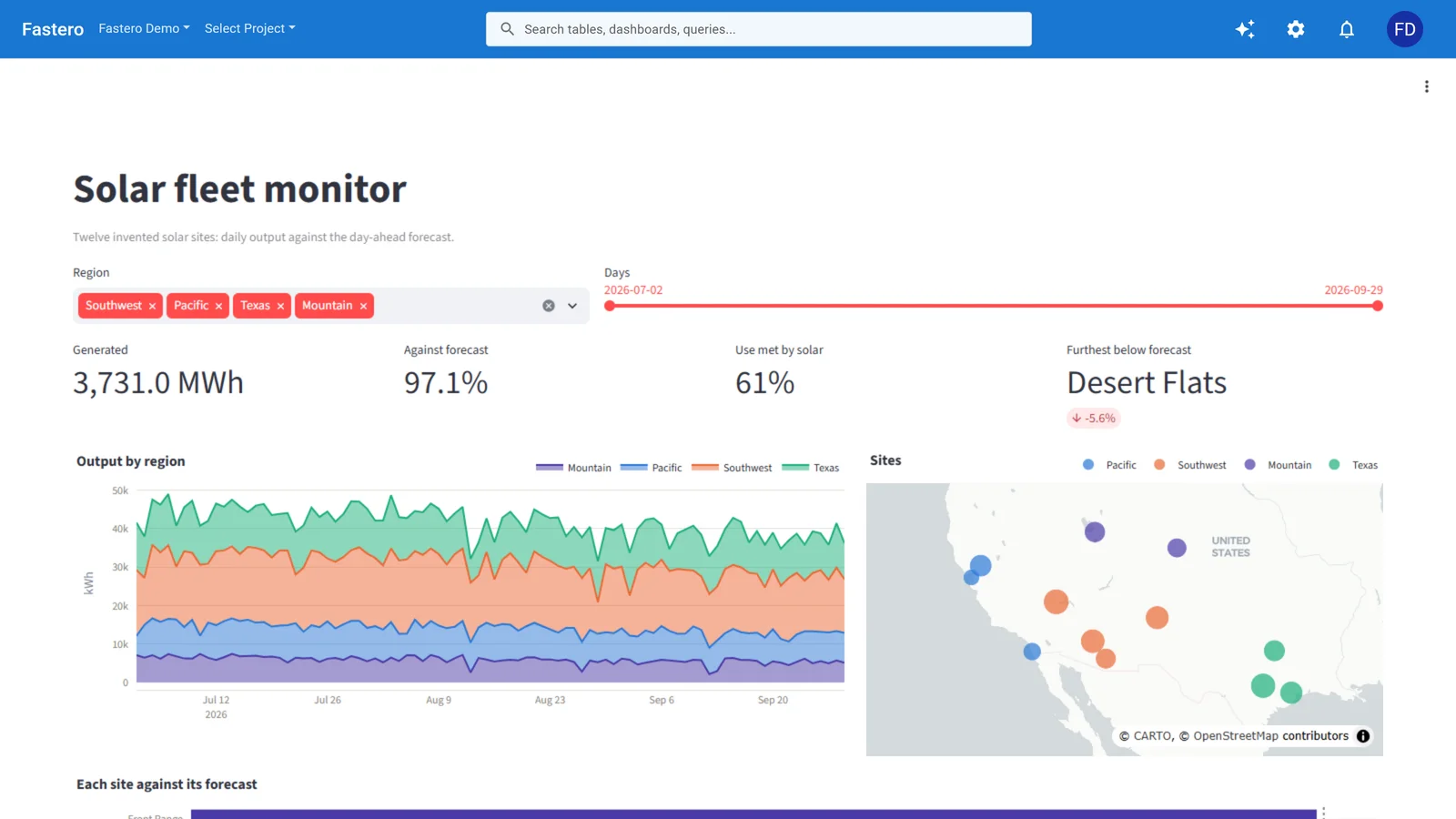
A Streamlit app running in Fastero. Sample data.
- Import from your repo. Paste the repository URL and branch, and Fastero clones the app; private repositories take a personal access token.
- Only your team gets in. The app opens for people signed in to your workspace, so example 8's login code is optional. Viewers are free and unlimited.
- Secrets stay secrets. Add
DATABASE_URLas a secret, and Fastero writes.streamlit/secrets.tomlfor the app — example 7 runs unchanged. - It's there when they open it. On Pro ($20 per editor a month), an app can stay on; otherwise it wakes when opened. Every new account gets 14 days of Pro, free, with no card needed.
See how Fastero hosts Streamlit apps, or compare the options in Streamlit Community Cloud vs paid hosting.
FAQ
Where can I find more Streamlit dashboard examples?
Streamlit's own app gallery collects community apps with their source, and the API reference has a small runnable example for every element. The eight above are deliberately self-contained, so each one runs on its own.
How do I make a Streamlit dashboard refresh automatically?
Wrap the part that should update in a function decorated with @st.fragment(run_every="30s"), as in example 6: only that part reruns on the timer. For data, cache queries with a ttl (conn.query(sql, ttl=600) or @st.cache_data(ttl=600)) so each refresh reads fresh rows without hammering the database.
How do I add a login to a Streamlit app?
Use st.login() with an OpenID Connect provider such as Google or Microsoft: install Authlib, add an [auth] section to .streamlit/secrets.toml, and check st.user.is_logged_in, as in example 8. Or host the app somewhere that puts it behind your team's login for you.
Can a Streamlit dashboard connect to Postgres or another database?
Yes. st.connection("name", type="sql") works with any database SQLAlchemy supports — Postgres, MySQL, SQL Server, Snowflake through its dialect, SQLite — given the driver package and a connection URL in your secrets.
Is Streamlit good enough for production dashboards?
For internal dashboards and data apps, yes: it's what most Python data teams reach for, and caching, fragments and connections cover the usual performance needs. What production adds is hosting — a login, secrets, and an app that's up when people open it — which is a deployment question rather than a Streamlit one.
Sources
Checked on 13 October 2026 against Streamlit 1.65:
- st.metric · st.data_editor · st.plotly_chart · st.cache_data
- st.fragment · st.connection
- st.login and user authentication
- Streamlit release notes · Fastero pricing
Related reading:
- Best Streamlit Alternatives (2026)
- Best Python Web Frameworks for Dashboards in 2026
- Streamlit vs Dash
Try Fastero free — run any of these behind your team's login, with secrets built in. No credit card required.